Ordering food, booking a flight ticket, purchasing designer apparel – these are just some of the ways people interact with businesses through apps. Apps make it a whole lot easier for internet companies to connect with their customers. You might argue that websites do the same, but not really. Apps are simply faster and make it easier to deliver personalized experiences to users. Here’s a simple question, would you rather visit Amazon’s website to purchase a product or buy it on the Amazon app?
49% of people open an app more than 11 times a day. When you open a consumer app, you are invariably drawn to visuals. Visuals play an integral part in engaging the consumer with your app. Where you place them, what colors you use, what CTA you add significantly impact customer engagement.
To learn more about the Future of Apps and how in-app content plays a vital role in delivering a captivating experience, we teamed up with ET Brand Equity to host creative and marketing leaders of leading consumer internet companies in India. We’ve handpicked a few important takeaways from the session that dives into improving customer engagement through In-App content.
Compare in-app content to the storefront of a retail shop, where the most attention-grabbing items attract more customers into the store.
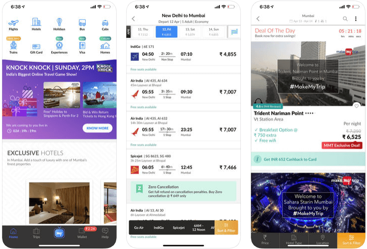
“Fundamentally, the way the team here and I at MakeMyTrip look at in-app content is almost the equivalent of how you would run a retail store. If you run a physical retail model, you have your storefront, where you put the jazziest items or the more high attention-grabbing items to get foot fast into the store and then make consumers try out your products.”
Somil Agrawal
Director – Marketing, MakeMyTrip
Somil further added that for an eCommerce platform like Make My Trip, the in-app content on the home page exactly does the same. Once the consumer opens the app, the quality of visuals decides whether you can retain the consumer’s attention and get them to play with the different features. From an overall marketing perspective, a very high deal of emphasis must go into the look of the homepage and storefront.

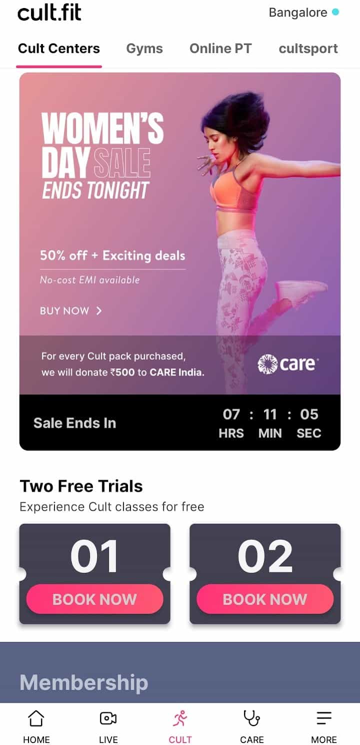
Visual content boosts conversion rates, especially for consumer-based products. A great app experience is often influenced by visual content. At an elementary level, the best way to make a person buy a product is to make them see it. A more challenging example would be how cure.fit uses in-app content to engage with their customers:
“Our vision is very challenging, but it’s very clear. We are here to make fitness super-fun for people. But how do we do that? It’s important for us to make the entire fitness lifestyle feel a lot more desirable for users, and that’s where we use in-app content.”
Shreeya Malpani
Creative Director, Cure.fit
Shreeya emphasized three critical points that can help you optimize the effectiveness of your visual:
1. Every visual has five important elements: imagery, typography, copy, negative space, and color. You need to be critical about these elements because users’ attention span is very low, and your real-estate is very small. You have to optimize each of these elements to ensure that you make the most compelling creative to get that user’s attention in less than 0.5 seconds.
2. You can’t look at each individual creative or visual in isolation. A great visual will deliver a long-term recall if these elements are used consistently but in innovative ways time and time again.
3. The shelf life of cure.fit’s visuals are very low. They constantly refresh their creatives to not lose users’ attention.
“You will see that there’s a brilliant visual, and it will drive brilliant CTRs; keep it for three days, the CTRs will plummet.”

In order to experiment with all the in-app elements mentioned above, designers typically spend endless hours on Adobe software, a tool that is great for creating the first set of visuals for your products.
But to create varieties of visuals for different products and personalize them based on location or language requires a creative automation platform.
It is not practical to keep asking your design team to churn out the different variations needed for personalization. Sure, your design team might be able to do the first two or three within a day, but then multiple categories and experiments go to them, which will end up choking them.
Providing the right type of visuals to the right consumer plays a key role in ensuring in-app content boosts customer engagement and drives your marketing ROI. It is vital to use your consumer insights to provide the best in-app content to your customers. Track the customer’s journey to decide when and where the visual would make the most sense and what type of message the visual should convey at each stage.
“From an in-app content perspective, for our latest launch of New Balance (A brand that Lenskart exclusively markets in India), we did a study of the TG(Target Group) we wanted to target, what was the user flow, and where all the banners would work. As a result, we figured out how to use in-app content on the checkout page:
If you use your checkout page (for in-app content), it drives more awareness towards the new launch or the new product. Because, after a person has ordered, they can’t miss (to check their) order, and they sort of scroll to discover what is there just below the order.”
Kumaar Brijesh
Marketing Team, Lenskart
Use AI and powerful recommendation engines to drastically improve the effectiveness of your in-app content. A powerful recommendation engine collects, stores, analyzes, and filters consumer data and decides what product should be recommended to each consumer. You can apply the same to in-app content to increase their effectiveness.
“In travel as a category, the point of interaction with the user is very limited, unlike food or clothing apps, where the user ends up going at least once a month. With travel, typically, the frequency is much lower. Hence, we use whatever information about the user to identify their behavior, which is then used to power recommendations.
In fact, a lot of our in-app creatives are also powered by those insights. If we know a user has depicted a particular behavior in the past, the kind of visuals that show on the storefront or homepage of the app is what we end up using. There’s definitely a lot of power in using consumer data and consumer behavior, and it’s an evolving model, and we are constantly working to improve it further.”
Somil Agrawal
Director – Marketing, MakeMyTrip
Why is it important for in-app content?
There are multiple levels of segmentation that you can do from the first-party data that you have. You can define cohorts based on age, location, iOS or Android device, number of orders placed by the customer, and more. You have to then prioritize and focus on a cohort that fits your business or the campaign you are running.
Licious, a meat and seafood company, uses audience cohorts to optimize the effectiveness of their in-app content:
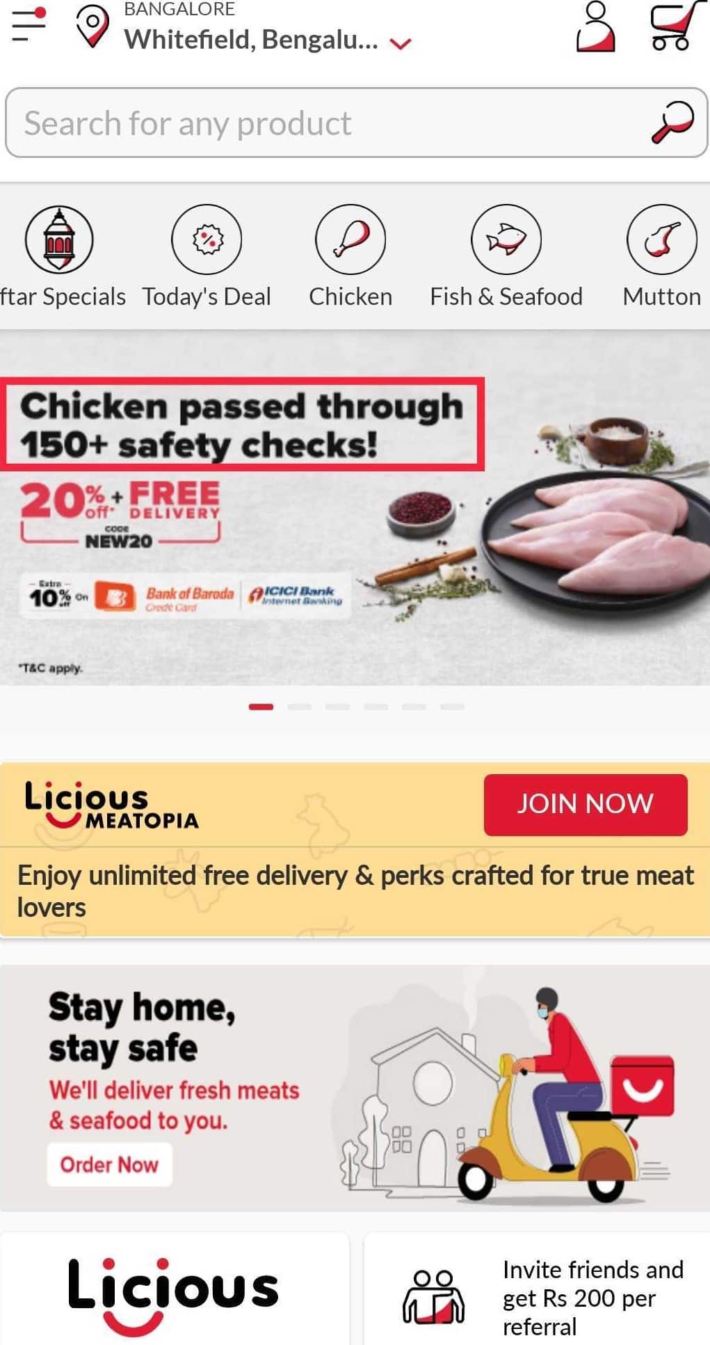
“For us, it’s very clear; the city is one very important variable, and secondly, the number of orders placed by the customer (if it’s a new visitor categorized as order 0 or someone who placed an order once categorized as order 1).
If you look at our performance marketing visuals, they were now talking about 100% safety. Whereas, our CR and communication, SMS, and In-App banners for repeat users spoke about 150+ safety checks. You might think, what’s the difference between both of them? But, when we saw the CTRs, they were remarkably different.”
Prathamesh Dembla
Head of Growth, Licious

To get the best ROI, you must experiment and explore new avenues. If a tactic works for you and you get decent results, then there’s nothing wrong with continuing with it. But without exploring other options, you will never know if that is the maximum ROI you can get. We suggest you wear the experimental hat and see where changes could be made.
For example, some businesses use vernacular personalization to boost customer engagement. You could take it a step further and insert regional nuances in place of generic translations in visuals to create intrigue in customers. Additionally, most of the time, in-app content only refers to images; try experimenting with GIFs and videos.
“You do experiments, and some of the experiments work, and some don’t. Whether it is in-app content or e-mail marketing, it doesn’t cost too much; it just incentivizes your creative team to think smarter.”
Kumaar Brijesh
Marketing Team, Lenskart
After you’ve come up with ideas to experiment with, A/B test them. Things to keep in mind while A/B testing in-app content:
Your in-app content must match with visuals and messages displayed across various other channels. When you can maintain a consistent user experience across multiple channels, you’ll be able to maximize your ROI.
“Just improving in-app content will get you an improved CTR. The real ROI impact comes when you can tie the user story end-to-end. Right from the point where the user has received communications from you, it could be an in-app notification, e-mail, or even a digital ad that the user sees on Facebook or Google. There on, if the communication is similar to when the user comes to the app, that is when you’ll get the best ROI.”
Somil Agrawal
Director – Marketing, MakeMyTrip
Ultimately, if your visuals can capture the precise intent of the user at the right time, the user will move on to the next stage of the marketing funnel. In-app content is a means to the end for personalization. Ensure your in-app content is relevant to whichever stage of the marketing funnel your user is in and deliver them before they lose interest.
As more and more businesses incline towards mobile apps, in-app content has become critical in capturing the user’s attention. From the key insights given in this article, you learned how to use in-app content to improve customer engagement effectively. Now all that’s left for you is to get cracking with Rocketium to create captivating campaigns!