
The human eye can distinguish about 10 million different colors. A LCD screen can display a possible color palette of 16.8 million colors.
There are many studies that link the relationship between color and emotion. As a video marketer, you can drive the emotion you want your viewer to feel, by using colors in your videos.
Here is all you need to know how to choose the right color palette for video:
Let’s go back to high school art class to discuss the basics of color.
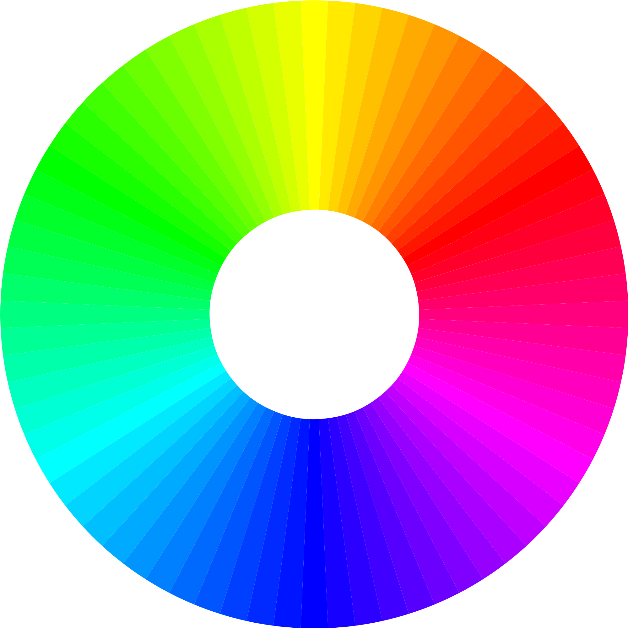
Primary colors: Red, Yellow, Blue. These are colors that you cannot create by mixing two other colors.
Secondary colors: Green, Purple, Orange. You can create these colors by mixing the primary colors.
Tertiary colors: These are the colors you can create by mixing a primary and a secondary color.
You’ve probably noticed that some colors look great together while others don’t. The colors you choose can either enhance your video and deliver the intended message, or they can steer the viewer in a complete different direction.
How many times have you viewed an entire video just because the color palette was pleasing to the eye? How many times have you quit watching a video just because the colors used were an eye sore?
You know that each colour has an exclusive wavelength, frequency and spectrum. Since colour is a form of energy, it affects how human beings feel. This energy has a direct influence on our behaviour, mood and thoughts. It even stimulates your pineal and pituitary glands to secrete specific hormones.
Here is how each color has an impact on your viewers’ emotions:
You can include red in your color palette for your videos where you want your viewer to be serious about the message you are conveying. Here is an example:
If you notice the first 3 scenes of this video, the numbers are highlighted in red. I did this to get your attention to the numbers, so that you can read them and feel the intensity of the statistics. Had the numbers been in a color that induce cheer or peace, I bet it would not have had the same impact on you.
You can also use red in your restaurant promotions. Here is an example:
Even though red is Zomato’s brand color, its use here induces a sense of appetite in the viewer. Videos have helped online food tech portals such as Zomato get more sales and viewers have known to recollect restaurants from similar video ads.
https://www.youtube.com/watch?v=KuYZLvA3dV4
The highlight color used here is yellow to make you feel cheerful of the fact that Amazon guarantees a 2 hour delivery for their Prime customers. Since this is something you would benefit from, a vibe of optimism is induced because of the yellow in captions and transitions.
The yellow is used here to encourage you to explore Banff and have fun while you’re there. A color like red would’ve been a poor choice for this video, since it would distract you from the message.
In this video here, blue is used to deliver the message that using videos in your blog is more productive that plain text and images. Since the video focusses on productivity, blue can be seen in every scene.
Blue is a good choice for travel and news videos. Here is another example:
Here orange is used in a food video to create a sense of excitement and pleasure of having some lip-smacking treats. in your mind.
Orange is a great choice in color for DIY videos, food recipe videos and general how-to stuff. Viewers will feel more creative and will followup on the tutorials.
The purple-pinkish hue used in this video is to give you a sense of success and wisdom. After watching the video, you will feel it is a wise move to upgrade your iOS version.
Absolutely! You can go berserk and add all possible combinations of colors. This looks really good on promo or announcement videos. Check out this promo video we made for a deal we ran with Siftery earlier this year:
In this video, we emphasised less on the images and videos clips, but more on the text and animations. Because of this, the choice of colors did not follow any rules or best practices. To reiterate, this kind of style works best for promo and announcement videos. In case you do experiment this with any other type of video, do let us know the outcome!
Checkout this 1 minute supercut examining (and celebrating) Pixar’s use of color: