Ad Design Streamlined with Rocketium
Automate the ad design process with templatized creation, feed-based scale, and multi-point integration.
Book a Demo
Automate the ad design process with templatized creation, feed-based scale, and multi-point integration.
Book a Demo
There is a science in the art of ad design because people interact with the world mainly through visuals.
Let’s rewind for some context.
There is constant debate over the processing capacity of the human mind. Some say it’s 4 billion per second and others say it’s 11 million. What everyone agrees on is that most of it happens unconsciously.
Why?
Because humans are inherently lazy, our brains use inductive reasoning to interpret data instead of spending energy actively consuming and processing information.
That’s why people skim, not read.
It’s also why people are better at grasping visuals. For instance, compared to text, a mind can comprehend images 60,000 times faster, which is how the Gestalt theory came to be.
The guiding principle of Gestalt Psychology is that the mind has self-organizing tendencies that help it perceive things as a greater whole. So, when a customer sees a banner ad design, they quickly take in the elements and combine them into a global whole.
Take this as gospel, and any marketing or advertising team can significantly improve what comes out of their ad design software of choice. And not just its aesthetics but also functionality and effectiveness.
“The elements and principles of design are not a recipe for creating a perfect piece of visual communication, but a knowledge and understanding of these tools opens the doors to a myriad of options and opportunities that may have otherwise remained hidden.”
John Lovett
For an advertisement to be effective, it is crucial to deliver a clear message that grabs the audiences’ attention. And both the elements and principles of design are vital to delivering that effectiveness.
Used right, they portray the product or service in the best light. Even when the visuals are clean and straightforward:

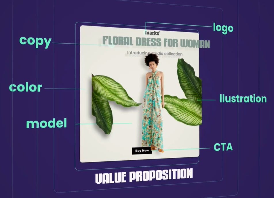
Think of the elements of banner ad design as the building blocks of any creative. They are the resources through which a designer has to convey the brand messaging visually.
One of the critical best practices for ad design elements is to keep them crisp and clear and ensure that it conveys the value proposition. In addition, the primary text should provide essential details and make an instant connection with the target audience.
Adobe does an excellent job of using the creative and the copy in tandem. The striking visual catches the eye and forces the viewer to read the copy.
Since it’s near impossible to pin down a compelling copy at one go, A/B testing different variations are crucial. Rely on customer reviews to get a convincing copy. Pull out snippets from them that catch the eye.
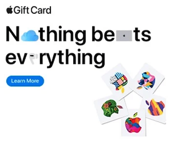
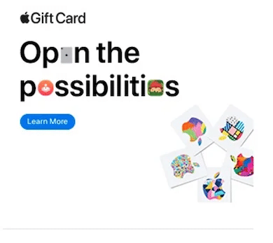
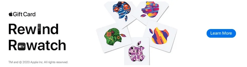
You can also use an automated tool like Rocketium to effortlessly experiment with the text’s font size, style, and positioning. Apple does it well by substituting letters with emojis.
The next element of ad design is the call-to-action. Since it’s meant to guide and prod users into acting, it has to stand out from the rest of the creative. Here’s an example of what not to do:

Notice how the bold, capitalized copy catches the eye, but the CTA button fades into obscurity. Changing the button positioning and increasing the size would have been more effective. Like this variation:

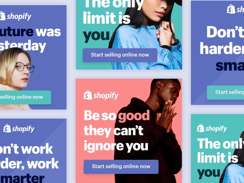
The CTA must also be concise and persuasive like Shopify does by tagging “free” in theirs. Customers love anything free.

When it comes to experimenting with CTA, think shape and copy. Something subtle, like the one Squarespace uses to match the theme of the rest of the advertisement, works.

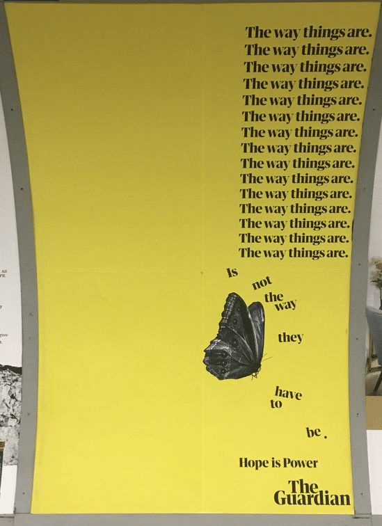
Or play around with copy like LinkedIn and The Guardian.


A more effective element for ad creatives would be replacing a Call To Action with a Call To Value. What’s the difference? The copy of CTA automatically stamps the creative as an ad, which triggers the muscle memory in viewers to skip or scroll past, especially when you’re advertising on social media channels.
The copy of CTV shows the value of the product to the viewer, bringing in actual clicks. Think: “Start Selling Online” rather than “Get Free Trial”, or “Discover your escape” instead of “Book Now”.
The Guardian does an excellent job of using CTV. Scroll up and this time pay attention to the copy of the button. It says “find your next public sector role,” instead of the cookie-cutter “Search Jobs.” Shopify nails it too:

The third banner ad design element is also the most important because people forget what they read but remember what they see. So, give the product image the position of honor. Then, showcase it in the best light.
Stick to high-quality pictures and repeat them across platforms to create consistency and build brand presence and recall. Take a cue from the F&B and the retail industries to place product images prominently.


Illustrations are typically used as an ad design element in the absence of product images or models. They may also be used along with product images or models to beautify the creative. They are excellent at grabbing attention and then keeping hold of it. You can also easily customize them by changing the style and color scheme to suit the promotional campaign.
Spotify is a leading example of how illustrations can change the ad game and still be used to convey brand messaging. Here’s a campaign representing the inward journeys users take just by listening to music with Spotify:

The ad design element that enhances the overall effect of the creative is the background. The best practice is to use plain, solid backgrounds if the display or banner ad has a lot going on in the foreground. Although, it’s not a rule of thumb.
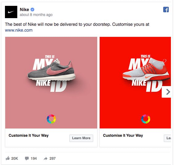
Take Nike, for instance. It uses a vibrant, colorful backdrop instead of white to draw users’ attention as they scroll down feeds flooded with content and creatives.

Starbucks uses the same “bursting with colors” strategy for its design backgrounds.

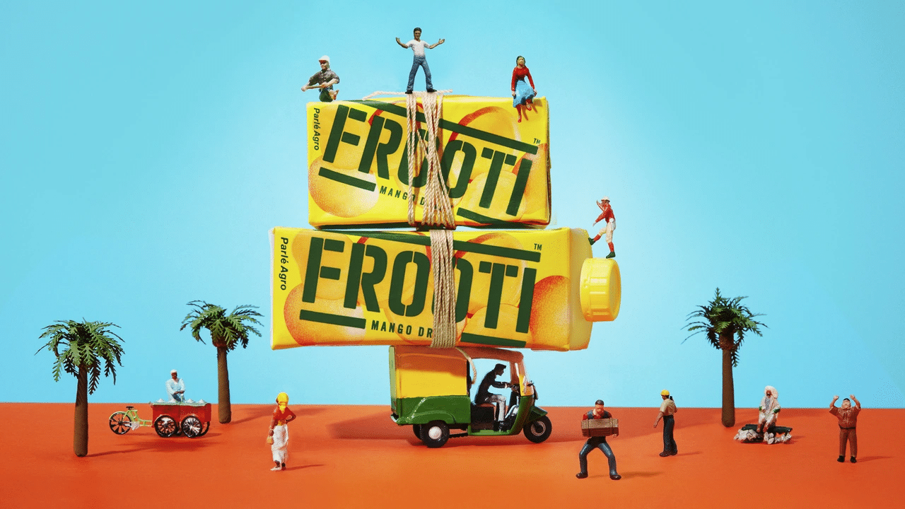
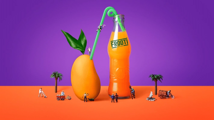
Another way to keep the focus on the product is by building energy using sharply contrasting palettes in the background. Just like Frooti’s playful design.
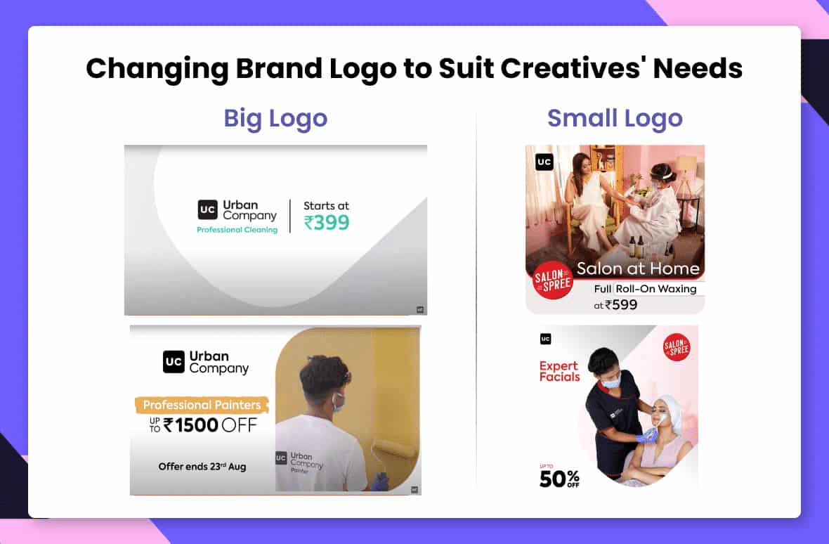
The way a logo can build brand awareness is unsurpassable. Viewers may forget names, but they remember logos, so it’s a must-add design element. Its placement must be dominant but not necessarily bigger than your value proposition.
Typically, brands position the logo in the top right corner because of eye activity. But the creation itself should clinch its placement and size.

You can experiment with the size of the logo in the ad design software as long as you ensure that it creates a positive recall. Take Urban Company’s example. For ad campaigns in markets where they have established their presence, they utilize the smaller version.
However, they prefer the full-size logo with a tagline for new markets where they are still inching their way in as it attracts more attention.
If the elements tell us what to use in a creative, ad design principles set the rules for how to use them to craft a visual message:
The pivotal principle of ad design is to lay out all the elements, from copy to logo, in a clear structure so that the most significant ones leap into the viewer’s mind first. Part of deciding the structure is picking if the reading order will be left to right or top to bottom.
Composition is part of it, so rely on the rule of thirds. First, place a grid over the ad design. Then add the element you want maximum user focus on, right at the center or at the top-left intersection.
When you see an ad design where something is not right, but you can’t pinpoint what it is, blame it on alignment. Most designs rely on left, right, or center alignment.
However, that’s just a starting point. You can easily align an element with other objects, such as fixing a copy next to an image for context. The rule of thumb guarantees that all the ad design elements are connected. The effect should be sharp, ordered, and pleasing.
Structure and alignment are necessary to balance the design layout, but fonts, colors, and shapes round it off. Avoid these rookie mistakes to prevent bad ad performance. One, using one too many fonts. Two, not scaling elements. Three, not using enough contrasting colors.
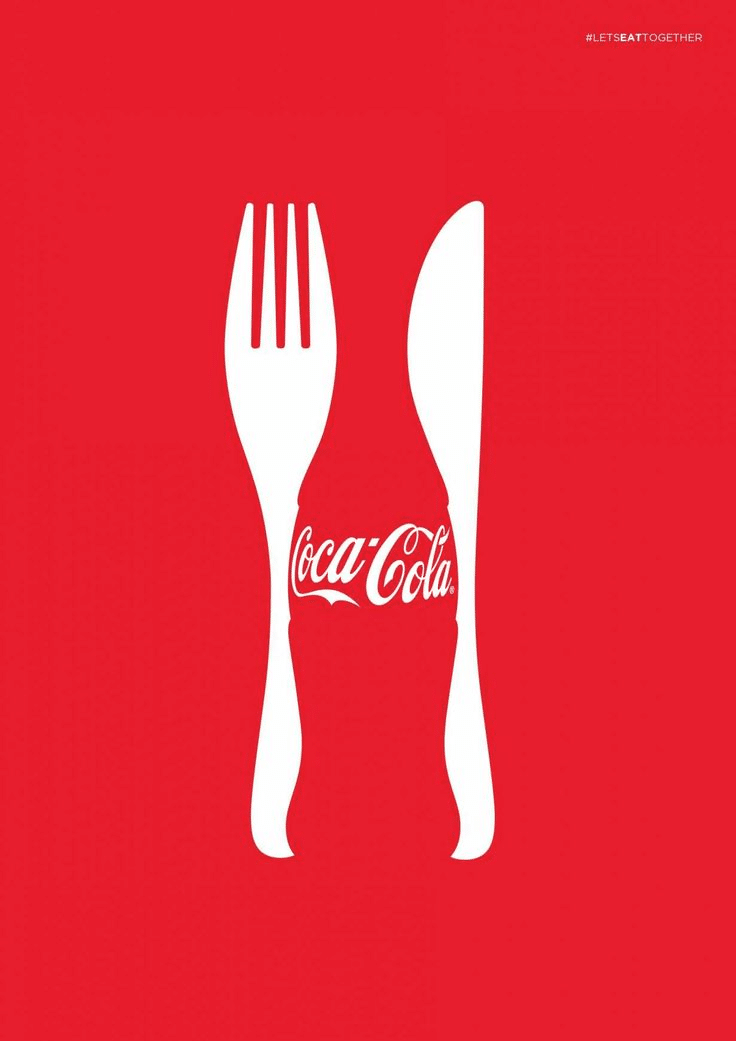
Color is a potent principle of design because different shades evoke different emotions. Moreover, consumers tend to link brands with colors. Pepsi is blue. Coca-Cola is red. Therefore, select colors that bring out the emotions you want your audience to feel when designing.
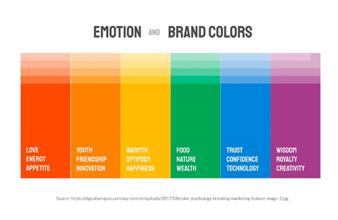
Instead of using a whole rainbow of colors, stick to 2 or 3 primary colors in your ads to avoid confusion and mismatch.
Legibility and readability are the two principles to follow when choosing fonts. Irrespective of how stunning an advertisement is, it will fail if the audience can’t read the copy. On the other hand, make it scannable, and they’ll assuredly click the CTA. Like color, don’t pick more than two fonts. Too many typefaces scatter focus.

Scaling means sizing each element of the design deliberately. For instance, by dramatically increasing the size of the copy or an image, you signal to the viewer that it’s essential. Essentially, the principle shows how to make sense of the ad without explicitly telling.
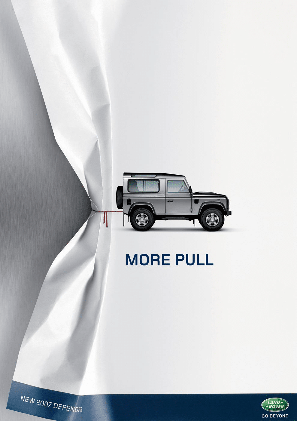
A banner ad design principle that’s repeated ad nauseam is KISS: Keep it simple, stupid. Yet, it is not easy to follow. One trick is to utilize negative space. Don’t fill up the white space between elements with too much copy.
Overcrowding the advertisement leads to confusion because there are too many focal points for the viewer. Instead, give the design room to breathe like Land Rover:
The degree of difference between any two elements of ad design is called contrast. Think thick and thin lines, small and large fonts, and dark and light colors.
It’s a powerful tool to make the ad pop, bring focus to a particular object, and create new meaning. But it has to be used sparingly. So, say, if you’re relying on contrasting colors to define the background and foreground, don’t use different font weights.
Repetition of an element in ad design creates an eye-catching aesthetic pattern. But to add real meaning or pull attention, it has to be subverted somehow.
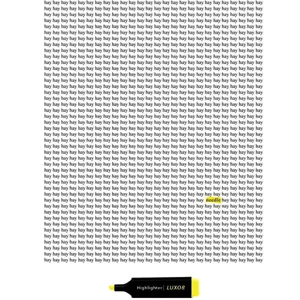
Remove a piece of the pattern. Change the color of one piece of it or simply switch it with another to convey a bold message. For instance, Luxor makes ingenious use of repetition and subversion to highlight its value propositions:
Repetition isn’t limited to copy. Colors, typefaces, shapes, or other ad design elements can be repeated to reinforce the message.
The majority of digital ads are static, but you can still add the appearance of movement to them using lines, edges, shapes, and colors.
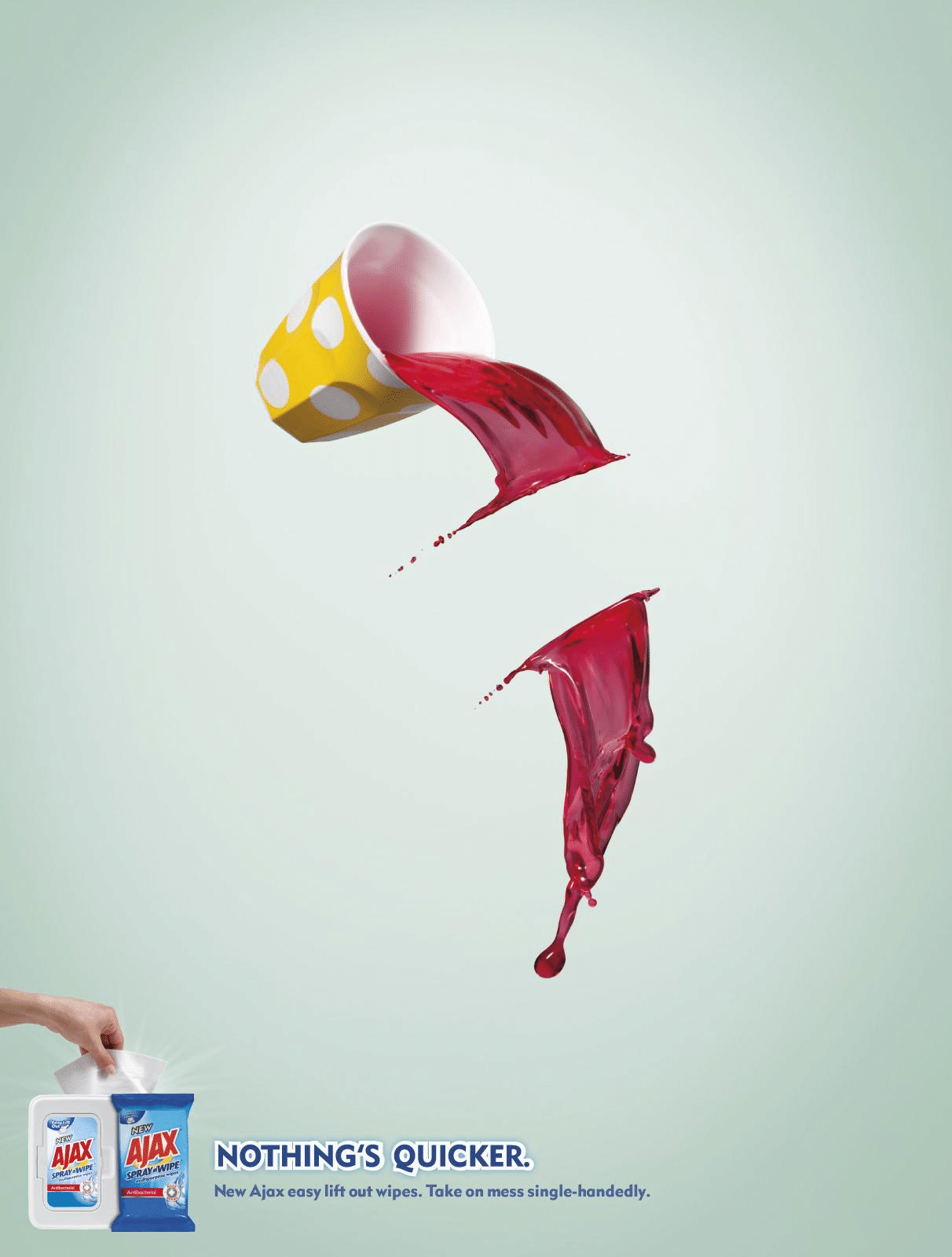
The movement also allows you to control how the viewer’s eye moves across the advertisement. For example, in this Ajax ad, the eye is automatically pulled towards the left and the bottom of the design, right where the product is placed.
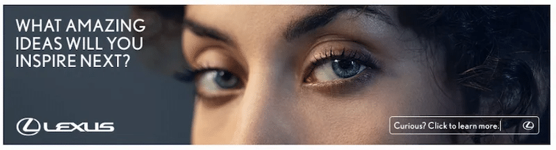
Another rather blatant way to direct the audience to the place in the design you want them to look at is to use the model’s gaze, as Lexus does.
Hierarchy in ad design means giving extra weight to the most essential message of the creative. It can be achieved by using larger font size, framing the key point in a particular shape, or placing it higher in the entire composition so the audience is naturally inclined to look at it first.
To check if you’ve used visual hierarchy to create the right focal point, get a fresh perspective. For example, find a team member not familiar with the content and ask them which part of the design they saw or read first, then second, etc.
“If everything yells for your viewer’s attention, nothing is heard.”
Arron Walter
There are limited elements to ad design, but the principles abound plenty. Many rules need to be followed from movement to proximity and alignment to hierarchy while creating effective digital advertisements. But none of them will work if you fail to design the ad according to the medium.
Each digital channel has specific requirements and objectives. So, each design has to be created with them in mind, making it necessary to create variations. But, at the same time, keep the visual tone and messaging consistent across the board.
Instead of manually tweaking each element, use ad design software like Rocketium. The creative automation platform unburdens designers and optimizes each design according to the platform.
Ad design software like Rocketium helps maintain consistency across campaigns. It saves ad elements like brand colors, fonts, textures, and shapes, making it easy for designers to follow or re-use them. Additionally, the creative team can set up specific rules to ensure automatic brand governance.
After a couple of key ad designs have been set, teams can automatically create personalized variations. This is particularly beneficial during A/B testing.

You can test most design elements: copy, backgrounds, CTAs, and shapes. Then use consolidated campaign analytics to find the winner. Moreover, with bulk editing, creatives can be tweaked in one go to avoid performance plateaus.

Digital Asset Management and Creative Intelligence are some features of ad design software that make it effortless to improve future designs. The smart DAM stores all product images for quick re-use. And CI plugs in reports from analytics and performance data of all creatives made on Rocketium to provide valuable suggestions.