
When the goal of the campaign is awareness & driving traffic to the website, it’s impossible to not consider banner ads. With the rise in online advertising, ad fatigue & banner blindness are common occurrences.
Banner blindness today is a familiar phenomenon. Users consciously or unconsciously ignore the banner noise.
Experts owe it to a phenomenon called “selective attention“. The definition goes as follows – The tendency to ignore most of what is happening around us when it occurs simultaneously & react only to certain stimuli.
For instance, on surfing through your favourite content online, you come across a swarm of banners. However, when they fail to stand out & set the right expectations you hit the cross immediately. No matter how hard one tries, it fails to grab the attention of the user & result in poor ad recall rate.

Banners are an integral part of adverts, both online & offline. What hasn’t changed over the years is the adaption of banners with the changing consumer preferences with the ubiquitous adoption of banner advertising.
To overcome banner blindness, a lot of factors matter including – Freshness of the banner, design, relevance, timing & positioning. When they aren’t aligned, the experience gets redundant & banners fail to stand out resulting in users opting out within seconds.
Back in 1998, when banner blindness was first identified by Benway & Lane it was uncovered – 44% of the dollars spent on online advertising was lost.
Ever since we’ve been trying to figure out a flexible solution that is less of a burden & more of an exercise to important insights for everyone involved. Creative automation helps achieve just that.
Creative automation helps address the issue of banner blindness & ad fatigue by personalizing & localizing banners at scale as per campaign requirements.
All that your target audience cares is who can address their problem efficiently. Loyalty is far fetched, hard-earned & incentive-driven. To stand out it’s very important to have a unique strategy set in place.
When innumerable businesses online compete for user’s attention, too many ads result in too little attention span & ad blindness. It’s worth the effort for every advertiser to prioritize user experience while creating banner ads & beat banner ad blindness.
By refreshing banner ads at regular intervals, either by replacing image or text, it’s possible to grab the attention of target audience.
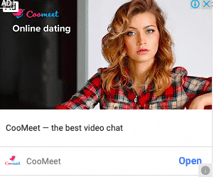
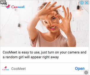
Take a look at the example below for an online dating app Coomeet. The variant to the banner has a noticeable change from the original – Text & the image is replaced, rest of the elements remain the same.
When the scale of the campaign is a single-digit number, executing it to perfection isn’t an issue. However, when we think about personalization & refreshing at scale the task becomes tedious for designers. Endless rework on the original banner to create variants instead of focusing on more productive creative tasks can be daunting.
Luckily, there’s a solution. One that can make every brand manager, marketer & designers life easy – banner ad automation. Automated banner production eliminates manual efforts of changing text, image & CTA individually. Simply, generating brand-compliant banners at scale with controlled flexibility in minutes & not hours.
The ultimate goal of a banner ad is to drive engagement among target audience & create an urge to click & land on your website to take necessary action.

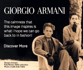
A good design spikes curiosity & triggers interest. Nonetheless, the unexciting part here is creating variants to test & figure out the design that sticks. All the design team has to come up with is a brand-compliant template & churn out variants as per required.
A visitor is likely to convert if they feel that your brand resonates with their needs. If you succeed in conveying the right message, they will end up buying from you. Detailed research on the prospect expectations will aid narrowing down the ads. Instead of displaying it to the general public, target it to the ones who are interested and are likely to pay attention.
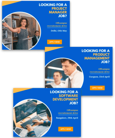
Relevance doesn’t just mean personalizing, but also localizing banners.
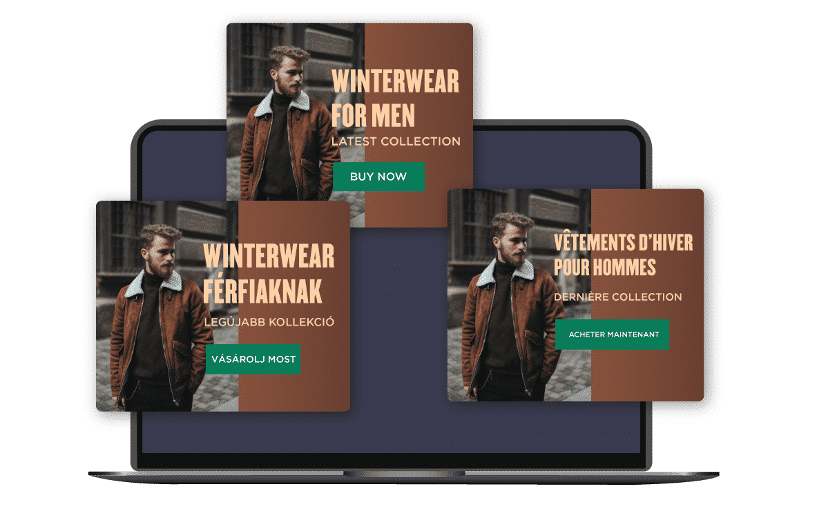

Automating the banner creation in the language as the preferred by the target audience can 3X the engagement & loyalty towards the brand.
Advertisers need to pay attention to the frequency of the ads. Too high frequency would display the ad over and over again resulting in flustered users. Too low of a frequency will lead to low recall rate.
Balancing the timing and frequency of the ads is crucial. Moreover, it will further help you to create a matrix, analyze the effectiveness and take necessary steps to rectify the issues.
Multiple variants of the same ad changing certain elements can help prevent ad fatigue & avoiding banner blindness.
Optimizing the placement of ads doesn’t just yield lesser cost per lead but also a higher CTR.
Traditionally banner ads are placed either on the top of the page or on the right side. However, it is easier to pay attention when something falls into your line of vision. Banner ads that are placed just below the navigation bar will help attract the maximum attention adhering to the fact that the top of the page consists of relevant content. Furthermore, these ads can also be placed in the content leading to better CTR rates.
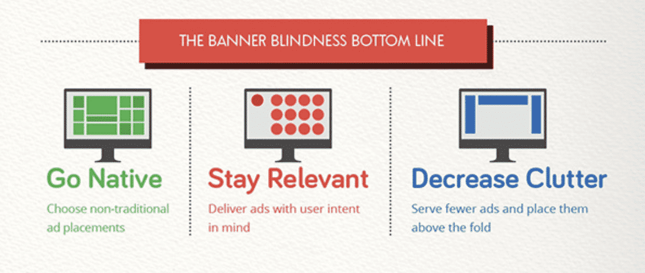
To figure out the effectiveness of the banner & the position that yields maximum engagement, one needs a banner in multiple aspect ratios. It’s impossible to imagine getting this done manually at a larger scale. With creative automation, it’s possible to choose the aspect ratios & generate banners in sizes of choice in seconds.

Banners were and will continue to be an important part of display advertising. Perhaps, when advertisers start emphasizing on users need & personalize the banner creation mechanism, the campaigns would see more success not succumb to banner blindness & ad fatigue.
A creative approach such as –
leaving the mundane & redundant task of creating variants for each banner ad to automation.
To revolutionize banner ads creation with creative automation is to choose the economical & fitting solution to speed up the campaign performance.