Ecommerce marketers estimate that there will be 2.14 billion global digital buyers in 2021. A quarter of the world’s population will soon be shopping online. This means that brands and agencies will have to find ever more effective as well as innovative means to grab people’s attention, direct them to their website or product, and optimize their sales funnel for conversions. The first steps towards making online sales, however, begins with having a robust SEO strategy and creating banner ads for brand awareness to potential customers, highlighting feature benefits, showcasing offers or discounts, all to entice potential customers to browse offerings and click on ‘buy now.’ In this article, we will share some design examples and tips on creating an effective display ad or ecommerce banner.
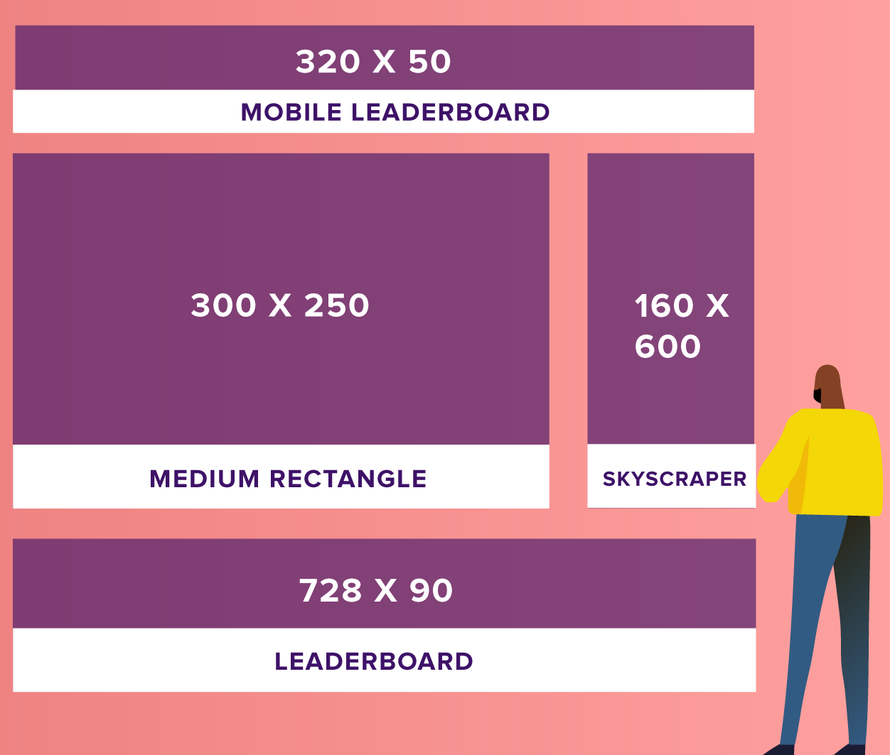
While the Google Display Network offers marketers a whole host of banner sizes to choose from, be it a half-page ad or a large mobile banner, not all of them offer the same performance. The four best converting eCommerce banner image sizes are as follows:
These four variations dominate the digital advertising world and account for 89% of all ad impressions. So you would be well advised to stick to one of these eCommerce banner image sizes and optimize the visual and copy for the size you choose.
Check out Rocketium’s automated banner builder to create and repurpose your creative in 100s of different sizes to suit different platform submission guidelines and campaign objectives
Do not compromise on image quality when it comes to designing your online ad. Here are some guidelines to keep in mind:
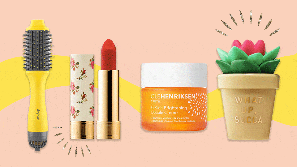
Online marketing guru, Neil Patel recommends picking images that are bright, full of color and eye-catching. The Worldwide Breast Cancer ad featured below was one of the best-performing ads of 2017. It stands out from the clutter with its bright-pink headline and non-standard visual.
Whereas this more recent IKEA sale ad uses clever wordplay and clean visuals to draw our attention to irresistible offers during the Black Friday holiday weekend.
Remember to optimize your image for the size, ad type, ad objective and platform you have selected. For instance, avoid using blue and white in your creative if you are creating an ad for Facebook. This is to ensure that your ad doesn’t end up going unnoticed. You want your creative to not blend in, but stand out
Source: https://neilpatel.com/blog/facebook-ads/
Lastly, try to incorporate images of happy people. While it makes us sound deeply shallow, pictures of women tend to outperform photos of men. We recommend featuring attractive-looking, smiling folks shown using your product for the best results.
Good design is absolutely critical to generating more ad impressions and influencing customers. Intentional and strategic user experience has the potential to raise conversion rates by as much as 400%. The Interactive Advertising Bureau says that display ads need to be “distinguishable from normal web page content and the ad unit must have clearly defined borders and not confused with normal web content.” And, we recommend that the message and design of your display ad match that of the website, or landing page. This is to ensure that the user experience is seamless, leading to more conversions.
Here are some other elements every ad must include:
Employing sound design principles will help you prioritize this information and convey more in the limited amount of space available. You can make creative use of color, typography, layouts, real-life images of people and product shots, use animated or other graphic elements. Together, this will contribute to the creation of compelling design for your ad creative. For instance, as in the creative below, typography can help you construct a hierarchy to make sure the most important information stands out.
You don’t need to have an army of designers to create ecommerce banners that get clicks. Get more done with less! Explore 1000s of pre-designed templates for ads or custom design a brand template here.
Display ads don’t offer up a whole lot of real estate, you have to fit your entire brand story or message in a 300 X 250 ad. So writing clever copy that catches the attention of readers and conveys a lot of information via a few, well-chosen words are important! We recommend the 3Cs approach, focus on compelling, clear and concise messaging to communicate with customers.
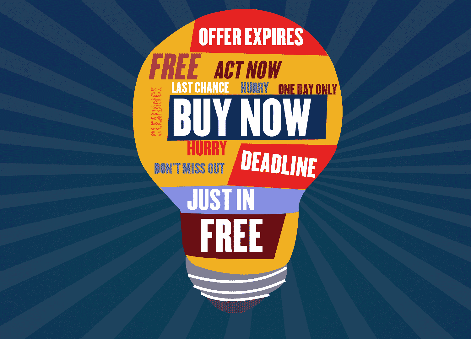
Use words that trigger clicks. Without resorting to clickbait, make sure that you use phrases that grab attention. Use strong, powerful action words and convey the urgency that will nudge the customer to click on the eCommerce banner image to take the intended action.
For instance, the Dropbox ad below makes use of a compelling statistic to offer proof of its service offering and invites users to try it for free. The disruptive clothing brand, Everlane manages to convey the earth-friendly construction of its outerwear, ReNew, created out of recycled materials like plastic bottles. And, Cisco manages to use fear to drive users to check out their security solutions.
Colors play a vital role in evoking emotion and subconsciously influence action. People associate specific color schemes with brands, for instance, Coca Cola makes you think of red. The psychology behind the usage of color offers some fascinating insights. Read more about how colors influence purchase decisions here.

Color preferences also differ by gender. One study showed that the most popular colors among men are blue (57%) and green (14%); while women are into blue (35%) and purple (23%).
This Nike banner is designed to create a sense of urgency and convey the energy of sport with its bold and unmistakable use of red. The CTA is in white which stands out against the background. Whereas, this fundraising campaign manages to break through the clutter, by using strong design and a refreshing pop of color.
HTML5 rich media advertising presents an opportunity for e-commerce marketers to beat display ad fatigue. Rich media is proven to increase display advertising performance by up to 267% according to AdRoll.
These ads can be used to convey urgency and also add energy to your ad creative. However, animations should be kept simple and not last more than 10 seconds. Don’t forget that your final creative has to load easily and have small file sizes. Also, remember less is more, so keep your interactive banner simple and clean.
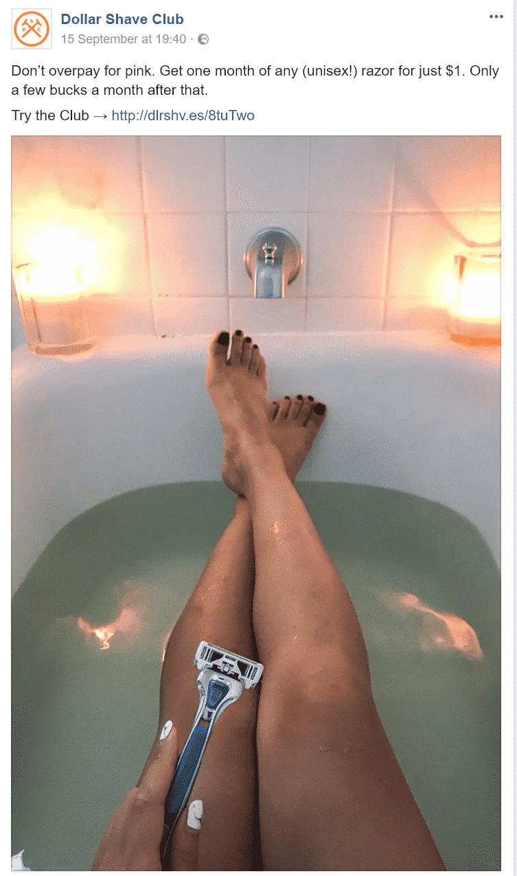
Google Ads allows you to reach potential customers with great precision with demographic targeting. For example, if your business caters to a specific set of customers, you can show ads to customers categories by their gender, age group, parental status, or household mean income range and location. Learn more about tweaking ad design as well as placement to suit your audience, here. See how the Dollar Shave Club that disrupted its category and got a huge amount of positive press. They use characteristic tongue-in-cheek humor to target women customers (a subcategory for them) in this creative that urges women to stop overpaying for ‘pink’ razors.
Lastly, ensure that your final creative prominently features a clear call to action or CTA button. CTA buttons are very important to increase CTR for your banner ad. Place CTA buttons on the lower right side in a color that complements the overall ad, but in a contrasting tone so it stands out as well as easy to see.
Furthermore, a slightly dated study from 2017 found that optimizing landing page CTA lead to a whopping 245% increase in leads. You can get granular and optimize your CTA for individual paid campaigns. This can be done by playing around with the placement of the CTA button and experimenting with phrasing, so that you move away from standard copy like, click here or buy now.
For instance, this Everlane ad chooses to highlight the gifting option in time for the holidays, whereas Casper Mattresses that sparked off a sleep revolution and racked up $750 million sales in 4 years, urges customers to try their product free for 100 days.
Rocketium allows you to quickly change your CTA to suit your campaign objectives and tweak every single element of your ad creative, even if you do not employ a large in-house design staff. Contact our team and request a demo to learn more about how you can go about creating custom-designs to suit your brand or explore 1000s of templates that allow you to go live with your ad campaign at scale.
Have more useful tips on ecommerce banner ad design? Tell us in the comments section as well as share this article with your network if you found it useful.