
With new brands emerging every other day, it is important to make sure that your brand stands out. Consumers recognize your brand based on the consistent effort towards creating a brand identity. A brand kit is the representation of the uniqueness your brand stands out. The significance and consistency of color across logos and other brand assets are huge.
Research shows that colors can have varying effects, from improving mood to causing fear or anxiety. Hence, if you want your brand to thrive, it is important that you understand the impact of colors.
A brand color palette includes a set of colors that represent your brand personality. The colors in your brand color palette will be used in your logo, on your website, in your business cards, etc. Hence, it is important to choose your brand color palette with the utmost attention.
Colors play an important role in delivering the message and the idea behind your brand. Studies have proved that 60% of the customers decided their affinity to a brand purely based on the brand colors. So, we can see that colors largely impact consumer behavior.
The entire process of creating a brand color palette can be quite nerve-wracking. But, not anymore! We’ve created a guide with 4 simplified steps to make your own brand color palette.
Different colors evoke a different set of emotions in the user. For example, red indicates urgency whereas white depicts peace. Understanding what each color means will help you choose colors based on your transparent brand personality. So, let’s look at a few colors and understand what they indicate.
To get an understanding of your brand personality and build your brand identity, follow these 2 parts:
Firstly, create a list of words that best represents your brand. So, to grease up your ideation process, ask yourself these questions:
Finally, once you have a list of words, correlate them with a suitable shade. For example, let’s say that you identify your brand to be fierce. Then, choosing shades of red or orange would suit your brand the best, in comparison to choosing a calming color like white.
In order to get a better understanding of how you can place your brand, research about 3 main elements:
Firstly, observe and make a list of the colors on your competitors’ brand palette. Doing so will help you understand the color psychology that they have incorporated
The market that your brand is in, must have a set of commonly used colors. So, it is advisable to include those colors in your brand color palette as the customers would find it relatable.
Finally, perform user research and carry out surveys to understand how your customers respond to your brand color palette. Perform at least 3-5 rounds of surveys to get a comprehensive understanding of their color preferences.
Before diving into the colors for designing your brand color palette, it is important to understand that there are 3 main color codes:
For the purpose of creating a brand palette, you will be using the Hex system.
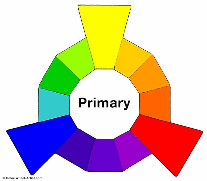
Primary colors form the basis to create secondary and tertiary colors. There are 3 mains colors that vary based on the color code:
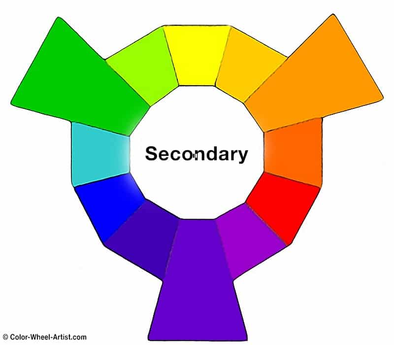
Secondary colors are created by mixing two or more primary colors. It consists of purple, green, and orange. Here are a few examples to create tertiary colors:
Purple = Red + Blue
Green = Blue + Yellow
Orange = Red + Yellow
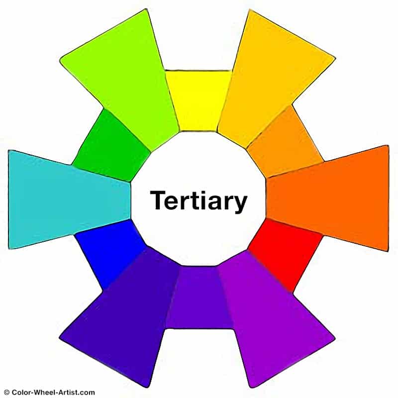
Finally, tertiary colors are created by mixing one primary color and one secondary color. Hence, they have double-names such as yellow-green, red-orange, etc. There are 6 tertiary colors on the whole as shown below.
In addition to this, there are 4 other terms namely Tint, Shade, Tone, and Hue that you should be familiar with.
Now that you have a detailed understanding of colors, choose 3 main colors to use them to build your brand color palette. Although, some brands have 4 colors on their brand color palette.
Pick a color that significantly represents your brand. The base color is the most crucial color as it will use up 60% of your brand color palette. Moreover, it will determine the accent and neutral colors.
Your accent color will have to blend well with the base color that you have picked. However, you will be using this color for only about 30% of the space.
The neutral color will take up only 10% of the space. Although, white and grey are commonly chosen as neutral colors and used for the background.
Once you have picked out a few colors, try them in combinations to find out which works well in harmony.
Now, let’s take a look at a few companies to get some brand color palette inspiration:
Apple has a simple combination of black and white in its brand color palette. Black provides a sense of sophistication and appears classy to customers. Whereas, white provides a sense of simplicity that removes the taboo of technology having to be complicated.
Here’s a video showing the evolution of Apple’s logo over time.
Visa’s brand color palette primarily consists of dark blue. Dark blue is found to deliver a sense of reliability to the customers. In the past, Visa’s brand color palette used to have a combination of gold and blue. However, they observed more customer engagement with more blue in their color palette. Hence, they eliminated gold entirely over time.
So, here’s an ad that highlights Visa’s core brand colors using various multiple elements throughout the video.
You could say that this is one of the most recognized brands around the world. The brand color palette is a combination of red, blue, background blue, and white together representing the feel of temptation and thirst. Further, it’s a symbol of energy and sportiness and evokes the fresh feeling amongst the target audience.
How can we miss bringing Coke to the discussion when we talk about Pepsi. Nah! Here’s a video outlining the evolution of logos of both these beverage behemoths.
Once you ideate and decide your brand color palette, you have to use those colors in several places so that your customers can identify you. Here are some of the places where you can use your brand colors: