Scale Creation with Creative Automation
Automate the creative production process with templatized creation, feed-based scale, and multi-point integration.
Learn more
Automate the creative production process with templatized creation, feed-based scale, and multi-point integration.
Learn more
Now, I don’t mean to boast, but we have some of the world’s best designers making video templates for our Rocketium users. I invited them over for beer and got them talking about their favorite and go-to fonts for the templates they make. Here is the first part of the master list of best fonts for videos and images.
So go ahead, bookmark this, share it with your design team, and of course, let me know if your most liked font did not make the cut. Yes, I might just add it to the next list!
Psst.. btw, ALL the fonts mentioned below are available to you by default in Rocketium. And, we upload fonts based on requests too! Our competitors are *really* jealous of this.
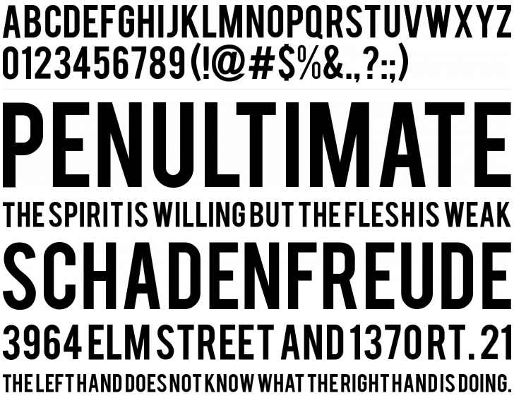
Bebas font
Bebas is a free display font for headline, caption, and titling designed by Ryoichi Tsunekawa. This is a freeware typeface. It means that you can use the font on your commercial or non-commercial works for free.
Get the font here.
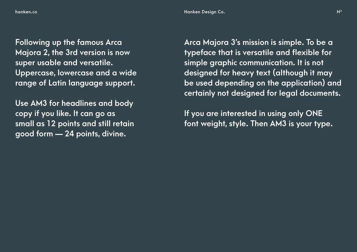
Source: hanken.co
Arca Majora is a simple font designed by Alfredo Marco Pradil, a professional designer from Dubai, UAE. With sharp tips and bold stems, you can use this typeface for high-impact communication through your brand’s videos, especially for all your promo videos, explainer videos, and video ads.
Get the font here.
Rocketium is creative automation suite with over 170 font options for you to use in your videos and images!
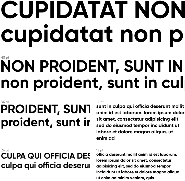
Gilroy font family
Gilroy Bold is a part of the Gilroy family by Radomir Tinkov, a graphic and web designer from Sofia, Bulgaria.
Get the font here.
Source: MyFonts.com
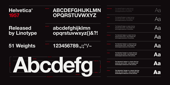
Helvetica was designed by Max Miedinger in 1957. He named the original typeface, Neue Haas Grotesk. Dial forward a few years, and in 1983, D. Stempel AG and Linotype re-designed the Neue Helvetica.
Get the font here.
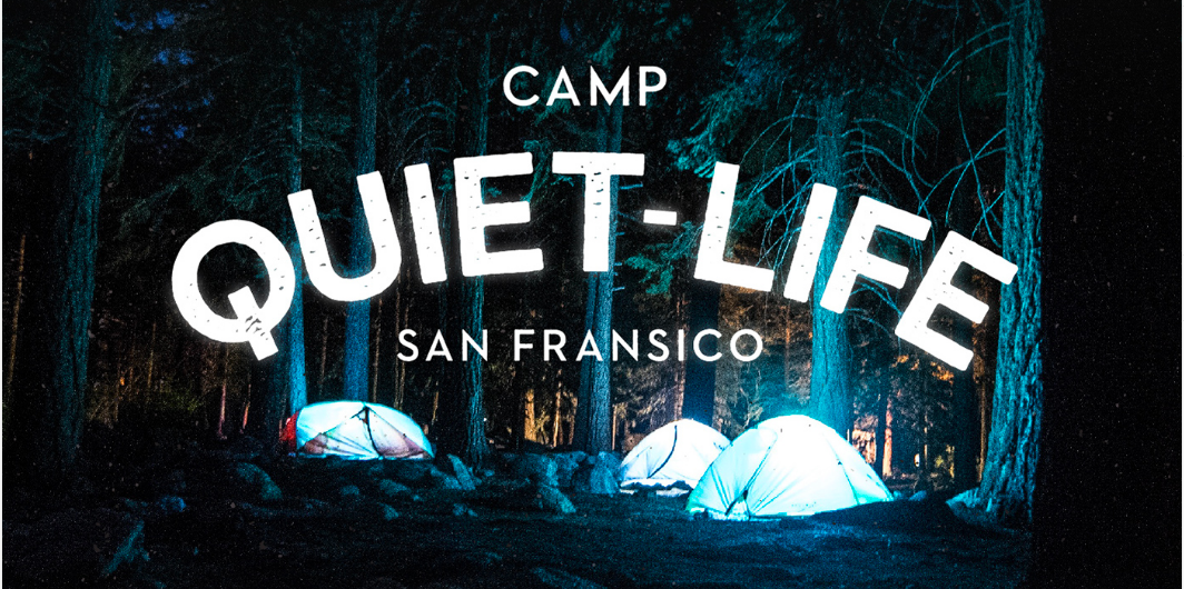
Sonder sans
Designed by Andrew Herndon, a graphic designer from the USA, Sonder is an exploration on vintage lettering. It is perfects for logos, advertising and headings.
Get the font here.
Designed by Christian Robertson, Roboto forces a rigid rhythm which makes for a more natural reading rhythm. Though the forms are largely geometric, this typeface features friendly and open curves.
Get the font here.
Lato in Polish means ‘summer’. This typeface family was designed in the summer of 2010 by a designer from Warsaw, Łukasz Dziedzic.
When you want to portray a feeling of warmth sprinkled with a dash of stability and seriousness, you can include Lato for your brand videos. Get the font here.
Designed by Andrew Paglinawan. He designed this typeface for display purposes but also kept it legible enough to use in small sizes as well.
Get the font here.
Source: 1001fonts.com
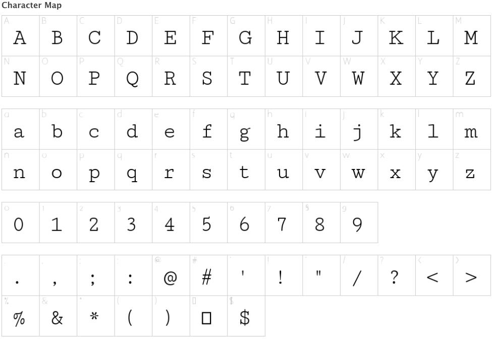
Designed by Vernon Adams, Cutive is based on a number of classic typewriter typefaces in which the old typefaces faces re-emerge as webfonts that are useful for adding character to body texts as well as in larger sizes for headers and display.
Get the font here.
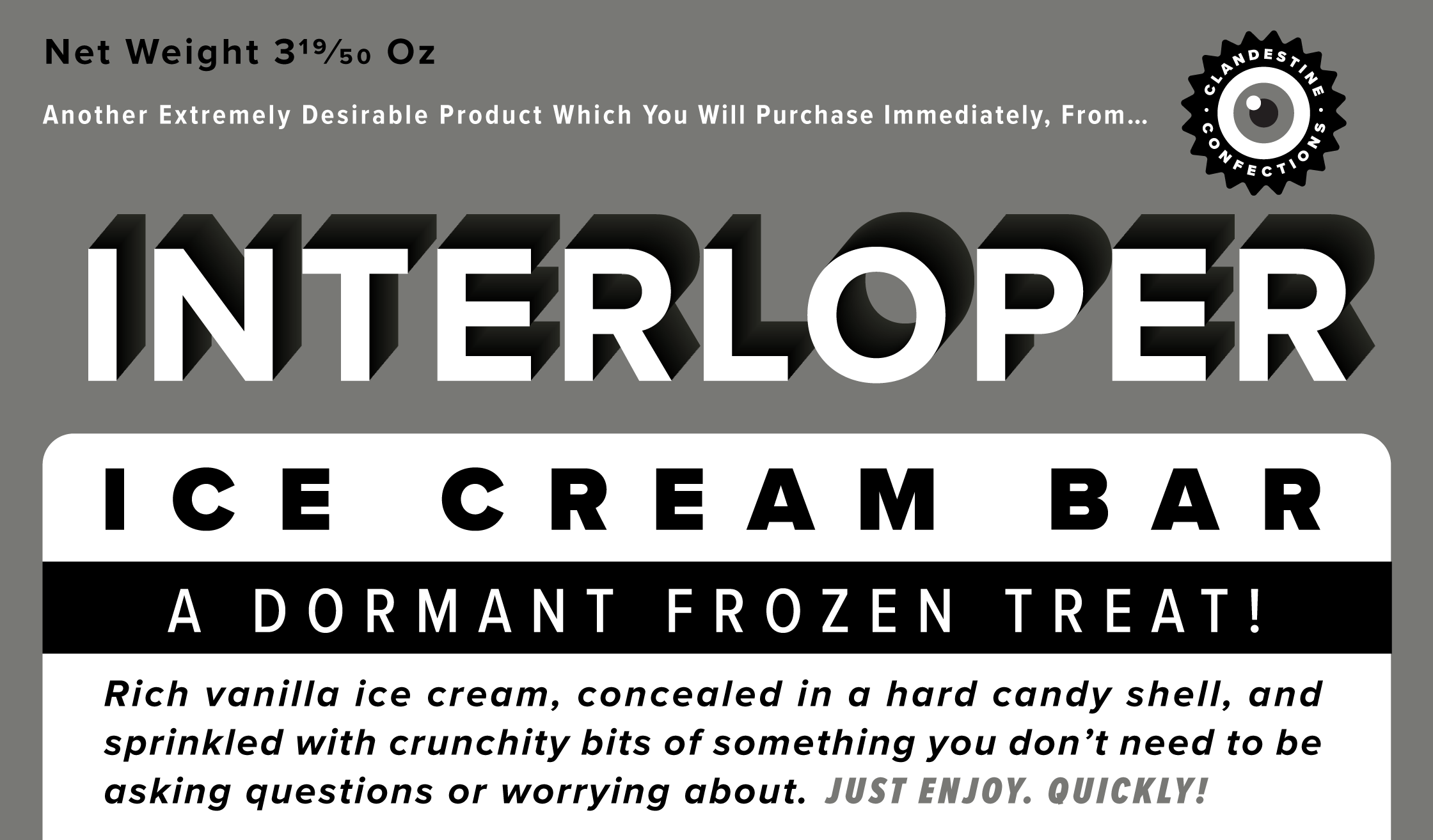
Source: www.marksimonson.com
Designed by Mark Simonson, Proxima Nova bridges the gap between typefaces like Futura and Akzidenz Grotesk.
Get the font here.
Part 2 of this list coming up real soon.
There are so many font options that more than often we find ourselves in a confusion as to which font you should pick for your design and eventually for your brand. The font is such an integral part of any design and gives a personality to the designs. After all, the best fonts are the ones the customers like the most. The ones that generate a lot of engagement for your designs. This is where A/B testing helps.
You must iterate your designs using different fonts and see which font engages your audience more. This is where creative automation can help. You can easily iterate a master video or image with different fonts with a click of a button using Rocketium’s creative automation.