
Brand equity in the digital era is shaping up fast. The increase in social media conversations makes up for the growing part of brand perception amongst consumers.
This leads to an important question—How to maximize the brand value by monitoring, listening, and launching campaigns that consumers love to interact and initiate conversations?
Let’s say you’re casually scrolling through social media and which one of the below are you most likely to notice?
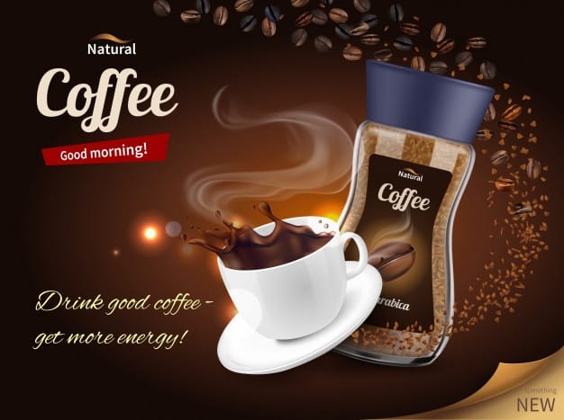
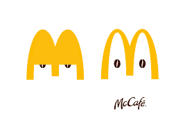
The campaign to the right?
Well, then you’re like the majority of the people who found the second visual more appealing and relevant.
Both the campaigns aim to deliver the same emotion — Refresh and energize with coffee. However, the campaign by McDonald’s stands out due to its minimalist approach towards design with brand consistency.
Customers develop an opinion about your brand long before they show the intent of purchase. The recall factor is established through consistency in visual elements and messaging across all the campaigns. Overall inspiring, emotional marketing to elicit customer response won’t just happen with the right message. It’s backed equally by the font, color, and images that speak for the brand in the campaign.
Note, the brand association doesn’t happen overnight. It takes its own sweet time. Although the point to consider here is that it solely depends on the people’s perception of the brand.
‘Content is king!’ has been the mantra for success in the field of marketing for years now. Indeed, marketing in the past relied heavily on the SEO ranking factors with no real focus on visuals. However, this old school strategy holds good no more.
The new-age marketing is defined by creativity and creatives. Words no longer engage an audience on its own.
Every other customer-facing channel be it YouTube, Facebook, Pinterest, Instagram, or other lesser-known social media platforms is flooded with visual-led content by brands. The catch? The ROI on visual campaigns is 200% more in comparison with the text-only campaign.
Want your customers to remember your brand?
Use visual content!
About 65% of people are visual learners. Moreover, 83% of the customers who watched a branded video shared it with their friends.
Improving brand awareness through visual content ultimately leads to improving brand equity. Like we discussed earlier, it requires attention to detail and planning so strong that it can stand the test of time. Brand awareness offers an edge to influence purchase decisions when your customers are in a dilemma to choose between brands. Thus, it’s important to maintain a consistent tone and imagery across all platforms so that your brand is easily identifiable.
According to the Cisco Visual Networking Index, videos will contribute to around 82% of internet traffic worldwide by 2021. Although video production can be expensive, it’s a worthy investment to attract more people to your website and improve traffic. Videos deliver a 41% higher click-through rate compared to plain text. If creating extensive videos are out of your marketing budget plan, here’s a lesser expensive alternative for you.
Use shorter videos with a great call-to-action on different sites to engage viewers. This might sound counter-intuitive as the primary goal is to drive traffic to your website. But, having your brand’s presence elsewhere might drive more customers to your website as they would want to learn more about your brand. Besides, if you want your videos to appear in the search results, remember to include the right keywords.
There are several types of videos that can help you showcase your brand. To improve website traffic, here are 3 main types of videos you can use:
Pre-roll videos are short advertisements that appear just before the main video content. These videos are known to raise the curiosity of users that ultimately lead them to your site. Here’s an extremely targeted pre-roll video by Burger King.
Google’s search engine highly favors “How To” videos, hence they are ideal to increase your website traffic. Also, these videos also show your customers how to better use your products and services, thereby increasing the chances of a purchase. Here’s a “How To” video by Birchbox on using contour.
These are great to introduce your brand to potential customers in a positive light. Review videos are better suited for social media streams rather than on your website. This technique worked wonders for Castrol when they partnered with Austin Evans, a gaming vlogger.
Adding visuals to your content makes marketing campaigns more interesting and helps keep the audience engaged.
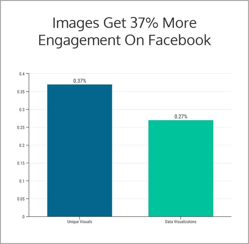
Facebook posts with images have 37% more engagement compared to text-only posts. Meanwhile, visual posts on Twitter observed an increase in retweets by 150%. That’s how powerful visual storytelling can be. Hence, incorporate visual elements into your marketing campaigns to improve customer engagement.
Scaling visual content and timely generation of variants for campaigns is crucial to test out ideas and counter digital fatigue. By retaining the original brand’s visual elements and keeping it consistent across all mediums of communication including social can help uphold brand equity.
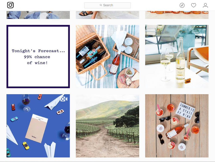
Winc is a popular wine club that delivers wine to your doorstep. The brand is all about simple convenience which is reflected by their visual identity. Their color palette is muted, thereby providing a sophisticated touch to their brand. The site features simple illustrations and minimalistic design to maintain focus on their product.
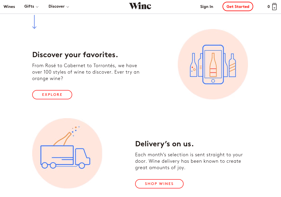
Winc maintains a similar approach for their social media pages by ensuring that they stay elegant and sophisticated. Such consistent visual identity across platforms enables customers to identify themselves better with the brand.
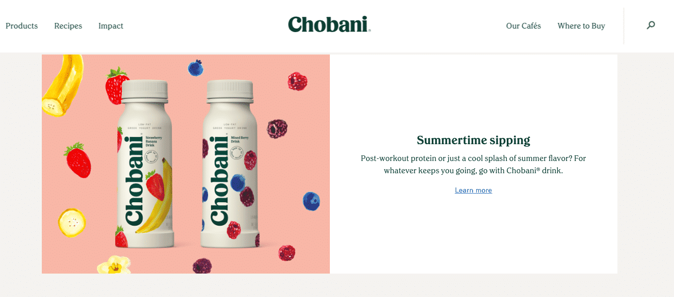
Chobani is truly an inspiration for all the creative folks in the field. For example, Yoghurt doesn’t specifically scream excitement. Yet, Chobani has nailed its visual identity and elevated the sense of attachment with its customers. Chobani uses its signature green on its packaging which helps reflect its natural, non-GMO ingredients. The backdrop on their website allows the fruit to pop thereby catching the eye of the user.
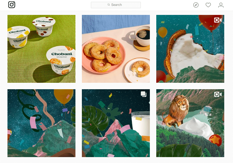
On the other hand, Chobani’s Instagram page is packed with unique illustrations, digital collages, and videos that use their brand color in creative ways. The fruit backdrop stays consistent along with Chobani’s signature green across platforms.
Tropicana’s redesign is a notable example of going overboard with restrategizing visuals. In 2009, Tropicana had invested 35 million dollars to repackage its best selling product – Tropicana Pure Premium.
Loyal consumers were unable to identify the product as the entire look and feel of it was changed. This lead to a decrease in their brand equity resulting in a loss of 30 million dollars. 3 main factors led to this regressive shift in consumer behavior:
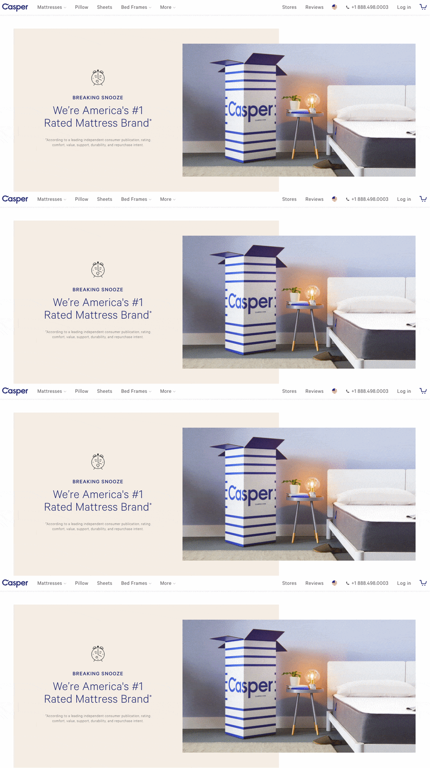
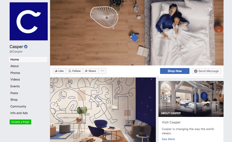
Casper is a recent startup that has disrupted the mattress industry with a slick visual identity and an innovative content marketing strategy. They primarily incorporate a soothing beige and blue along with hand-drawn illustrations to bring about a sense of comfort to all their platform from their website to their Facebook page.
Visual content can be the gateway to increasing brand equity. The consistency of visual elements in campaigns, advertisements, and posts to increase your brand awareness and customer engagement that can ultimately boost your brand equity.
Always remember not to change all of your visuals and branding elements at once. An average shopper notices a brand within 1/3rd of a second. It is important to retain the main reference elements so that your customers can recognize your product. Ultimately, ensure that your customers accept the change such that it positively impacts your brand equity.