More and more online marketers are turning to in-app advertising to get higher conversions for their display campaigns.
Apps convert 120% better than the mobile web with people spending up to 90% of their time browsing within the app environment on their smartphones.
Advertisers are scrambling to take advantage of this trend. In such competitive times, it is important to design banners that convert. In this article, I will walk you through some important tactics to make creative banner material for mobile advertising.
Even as the spend on desktop display ads declines, dollars spent on mobile display is set to grow from $7.1 in 2018 to $11 billion by 2023, worldwide. The very reason the article is written – To share some tips to create ad banners for in-app advertising, to increase CTR and better monetization.
Here are some pointers to keep in mind:
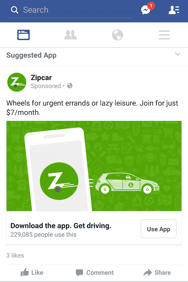
Banner ads get a bad rap for being ineffective because audiences tend to ignore a large number of marketing messages they are exposed to while browsing, but a recent Liftoff report indicated that banner ads tend to outperform native ads for post-install engagements on Android. These ads can still hold value for your campaign as long as they are designed with the in-app environment in mind, and modified for such a small screen, to be minimalist and non-cluttered in design. See the Zipcar example below and notice how the creative is simple in its layout? It is best to go for a clean, simple design so you don’t annoy viewers.
Don’t unthinkingly use the same creative across the mobile web and in-app environment, optimize your banner for display and readability for in-app. Ensure that you stick to your brand guidelines but tone down your creativity so only the most important elements remain.
Experiment with different elements that appear on the creative and visualize how your banner will look across devices, in minutes, without the hassle of repetitive design by using Rocketium’s automated in-app banner builder.
Ad networks and browsers penalize intrusive display advertising, so focus on engaging viewers in non-disruptive ways. Keep all text messaging, short, to the point, clever and snappy! Stay away from making misleading claims, but aim to arouse audience curiosity with an eye-catching headline that teases your offer and invites the viewer to click to seek more information, or act on an irresistible offer.
While putting text on your creative, keep in mind:
Keep in mind that you are dealing with distracted users with short attention spans and the additional constraint of limited screen space, so rework your copy so you are conveying the most important information first. You can tighten your headline and remove multiple lines of text if you prioritize the most important message you want your audience to notice and remember.
Pick bold, contrasting colors, use well-composed, high quality, non-pixelated images, and easy-to-read fonts for maximal impact. Never use grainy or low-resolution images as this will reflect poorly on your brand. Select images or videos that will work with different banner formats, across devices.
Choose from a library of 1000s of high-quality templates for your in-app banner. Click here.
Create creative banners that grab the attention of your customers, this would make it easier for them to recognize you the nest time your name or logo comes up. Ensure that the visuals add to the text message and vice versa. For instance, this static ad from GrubHub uses a high-contrast red background which is consistent with the brand palette and an arresting image of a juicy burger to make you stop scrolling and pay attention.

For GrubHub, less is more, they do not overload the banner with too much text and let one strong visual do all the talking. Learn more about getting more food orders for your restaurant on a food-based app here.
More and more brands are using HTML5 animated display ads and short videos that run under the max loop length of 15 seconds (as recommended by IAB) to engage with users. Using animation allows you to stagger your message across a few frames. Layer and time your messaging so it does not appear all at once, but keep the number of frames to a minimum. Avoid very distracting, fast-moving animation as it may be too intrusive in-app.
Remember shorter videos work better on the small screen. And think about how the video will appear within an app environment, there is no point using a badly framed or partially cut 16X9 video. For instance, this Bumble ad uses a simple vertically-formatted, selfie-style video to mimic the feel of user-generated content to share social proof in the form of a customer testimonial to drive installs for its dating app. This ad creative has received more than 1.5 million views and has been used heavily to promote the app on various apps.
Finally, keep in mind load times on mobiles and design a creative that is light for faster playback. According to the IAB, all auto-play video banners must be under 15 seconds and the default setting for any sound should be mute. Likewise, a mobile video ad must not expand, unless initiated by the user.
Like we have said in our recent article making a case for in-app advertising over campaigns designed exclusively for the mobile web, the smartphone offers endless possibilities for personalization and customization of offers, basis a host of factors such as the device ID, location, gender, and other demographic details. Ensure that you are leveraging the full power of all this data, by thinking creatively about how you can tailor your display ad to be maximally relevant, contextual, and interesting to audiences.
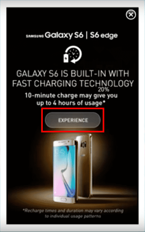
For instance, Ponds leveraged advanced geo-targeting to give users a real-time update on pollution levels in their current location to nudge them to use Ponds Pure White as an instant solution for their skin problems. And Samsung leveraged device ID and a user’s real-time battery status — to detect people whose phones were low on charge — and displayed targeted interactive offer banners that showcased the fast charging capability of the new Samsung S6. Check out these campaigns here.
You can also add a live data feed to your mobile ad and update specific design elements with data set to refresh at a specific frequency. For instance, you can highlight the number of items left in stock, highlight the number of tickets left for an event, showcase changing prices for a flight, the display changing currency exchange rates, showcase the week’s or day’s special, and switch out the background image based on the specific time of day and more, to increase your click-through rate.
Your call to action is a fundamental part of any banner ad. Think about the location and size of your CTA, especially on a mobile in-app banner ad. Experiment with the positioning of your CTA and ensure that the words are bounded within a button so they are easy to click on and activate. Keep in mind mobile-first design and move the CTA button to the right side of the ad, to make it more likely that your audience will click through.
You can change the CTA to suit where your customer is along the marketing funnel. Eliminate the hassle of repetitive design tasks, especially if you don’t want to overburden your existing design team, and churn out different CTAs to suit your campaign with the automated in-app banner builder by Rocketium.
Make the CTA very visible and easy to discover, because mobile users don’t tend to hover over creatives the same way they do on desktop banners. Keep the text short, catchy, and to the point. And word it in a way that urges the customer to take a very specific action that suits your message or offer. We hope you found this article useful in designing more powerful display creatives for in-app advertising. Do share it with your network if you found it useful and share any other tips you have on optimizing creatives for an in-app environment.
Creative banners may seem not-so-important but are one of the vital tools when it comes to create brand awareness and increase the recognition rate. The more creative you are, the easier it is to remember you.