Merchandising is key for any business eCommerce/retail to drive conversions. As the world recovers from the pandemic, all of us are setting foot into a completely new world.
It’s obvious that the safety-first frame of mind will have a huge role to play in the way we do business. Therefore, as more & more businesses move online, the piece of the puzzle to solve – “How to create a most effective store like experience online?”
Companies that have already taken the route of digitizing their business will lead the way. Today, as we all know it, attempts to capture the essence of retail experience online isn’t new. Businesses have been at it for a while now. Yet, the pandemic situation has forced every business to reinvent themselves to figure out their niche & strategize to top their competition.
Exploring this further –
How can one apply the rules of visual merchandising online?
How can one use data available online to go beyond the offline techniques used in-store?
Before I delve into this – What’s the difference between onsite merchandising & visual merchandising?
In a traditional retail set-up, visual merchandising is the strategic placement of products, digital signage, sales-reps conversations to drive more sales.
Online merchandising is the strategic display of products & information within an eCommerce store.
That said, listed are the top 5 visual principles that one in eCommerce business need to get a hang of.
Would you ever consider stepping into a store that doesn’t set the expectation right away?
The first impression matters! Here’ the trap for most marketers- take the experiential approach or experimental at large.
Same applies to online merchandising.
From some of the conversations that we had with our customers close to 50% of the conversions happen on the home page.
The eCommerce storefront is the digitized version of a physical store. The home page is where a potential customer decides to either browse further into your store or to bounce off the site. Thus, It’s important to ensure smooth navigation with the apt information visitor is looking out for.
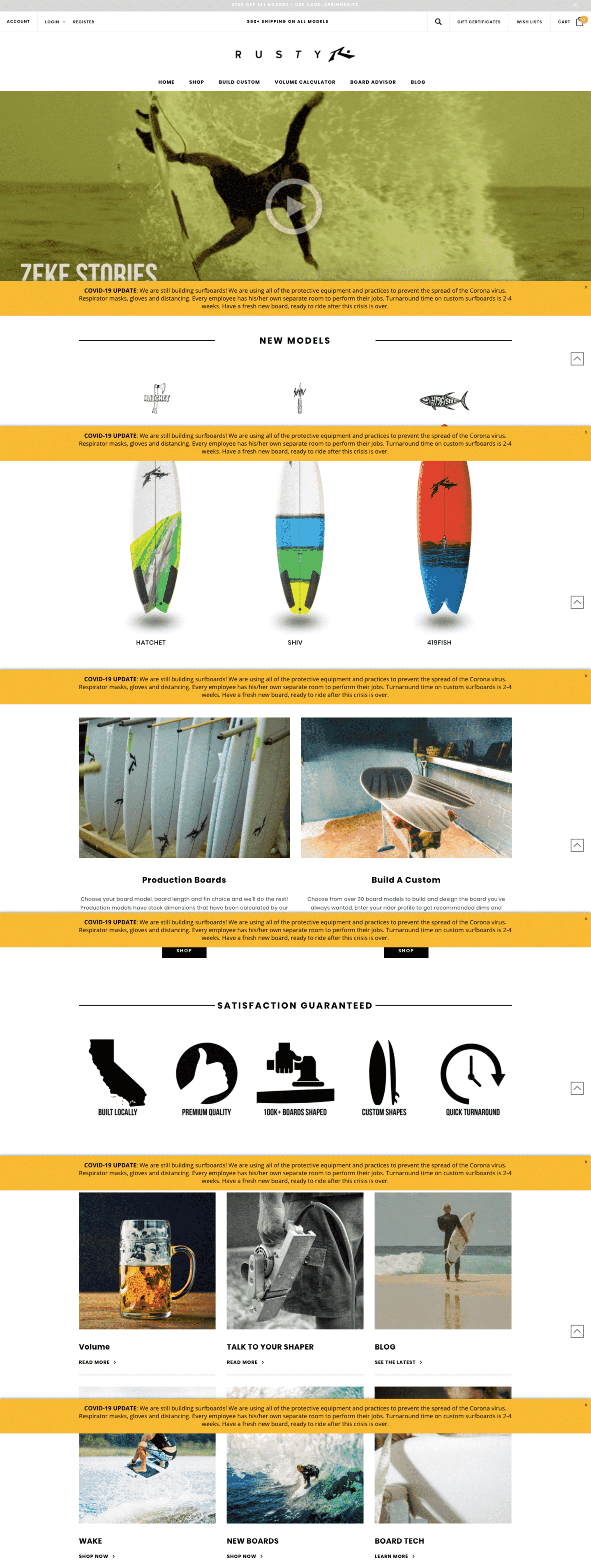
Rusty Surfboard, for example, hits all the right spots when it comes to their home page. Talk about an unconventional brand acing the merchandising strategy. It’s very captivating for three reasons –
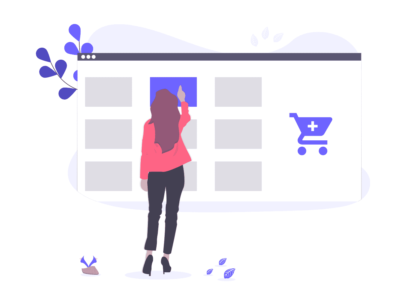
Visuals are the number one selling point to consider for any business. How can we not talk about product photos when visuals drive conversations.
Detailed product photos help consumers make an informed decision. By highlighting the features of the product & backing it with crisp description helps beat all odds.
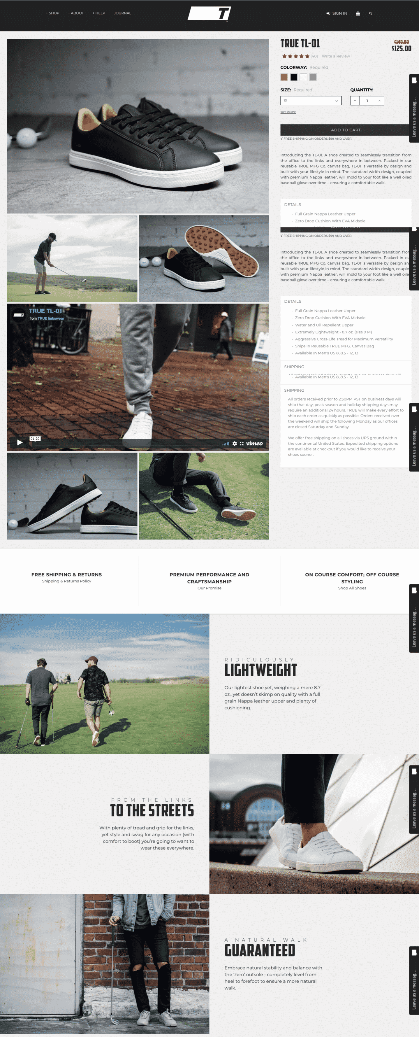
True Links Wear has it on point when it comes to eye-catchy product photos & engaging description.
Why this is stunning –
Nothing works like a charm for a brand than a validation of product from a fellow human.
Social proof serves as a source of authenticity that the brands can’t establish on their own.
47% of people only buy products rated above 4 stars.
When it’s visual it’s all the more appealing & serves as an unskippable merchandising strategy.
Not to miss, social proofing also highlights demands & the urgency to stay in trend. Apart from building trust it also ensures a transparent shopping experience.
There are many ways you can add social proofing to your site –
Why not part of the section earlier you ask?
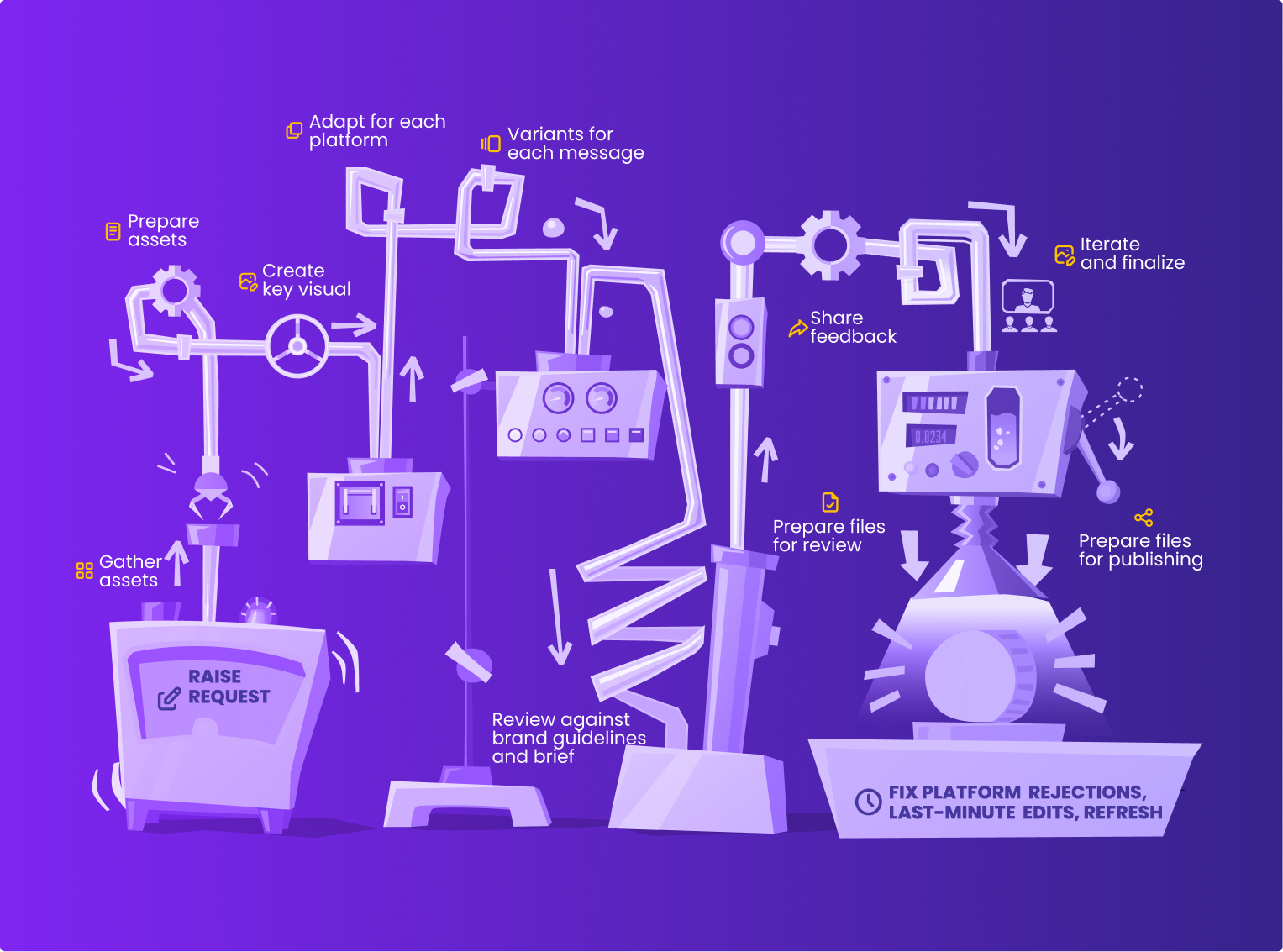
I didn’t club it with an intention to highlight the significance of UGC. This section deserves an article of its own. There’s so much we can talk about.
User-generated content has a direct impact when it comes to sales. The ways to execute this – multitude.
Why user-generated content works –
Launching a product for a global market comes with its own challenges. The competitive advantage for every brand depends on the capability & unique strategy they use to connect with customers at a regional level.
That said, as a starting point, brands can use the multilingual online store to target regional audiences.
The most challenging of all is serving onsite banners in regional language in real-time. However, there are a plethora of tools to assist in generating banners at scale in dimensions & language of your choice.
Why multilingual?
There is a multitude of tools out there like Smoolis, StoreHippo and so one that will help you set up websites with over 100+ languages and currency as well.
Online merchandising is all about strategically placing the products onsite. As visitors browse through your site, the experience needs to be enriching in terms of making available the products they’re on a lookout for.
Keep it minimal & visual to draw the attention of the visitors immediately. Banners convey the offers & highlight the features for visitors to make a quick decision on the purchase.
These principles will definitely guide you better in setting up a visual-first approach for your online store to drive more conversions.