Utilize Creative Automation this Cyber Monday
Automate the creative production process with templatized creation, feed-based scale, and multi-point integration.
Book a Demo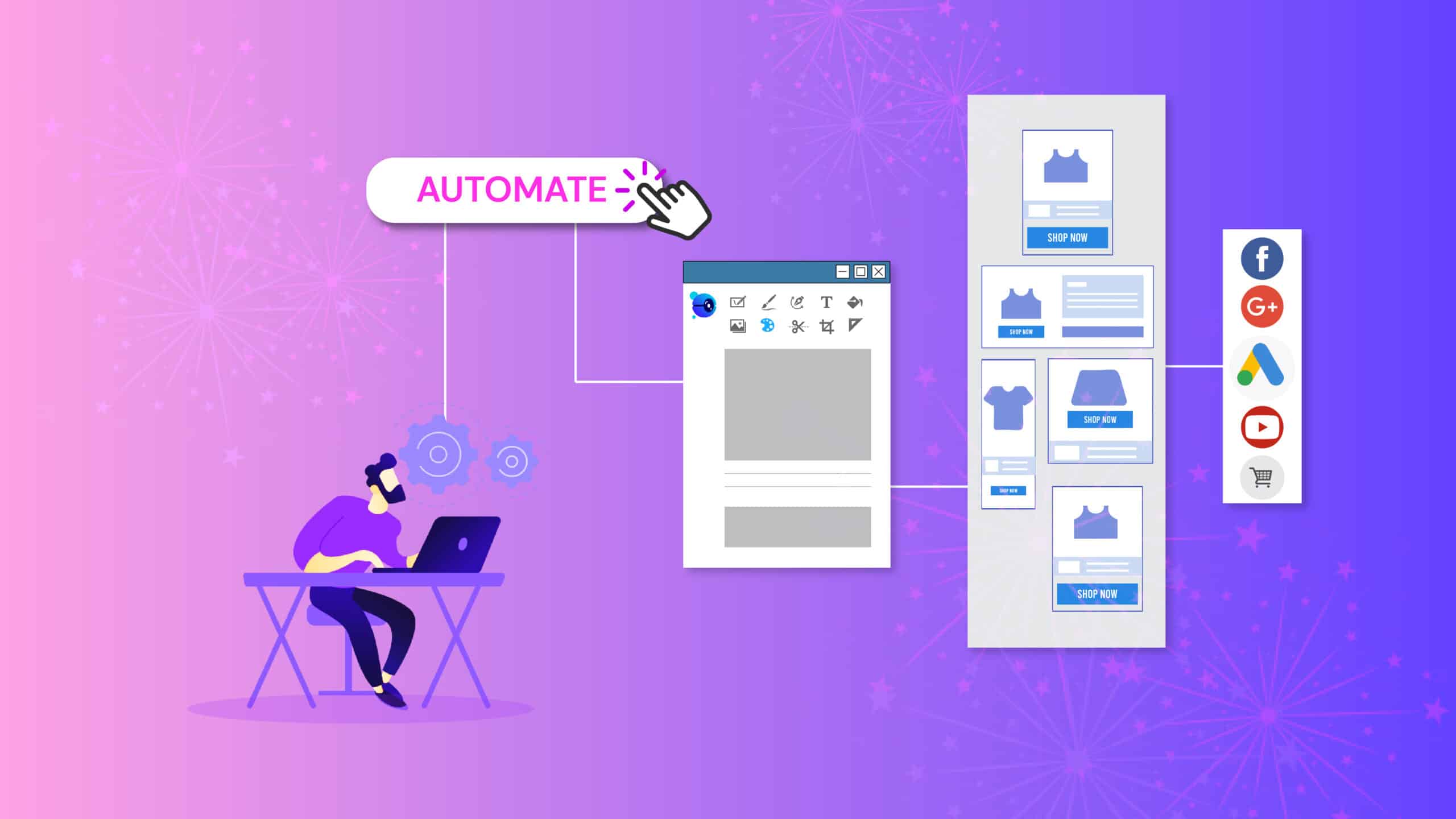
Automate the creative production process with templatized creation, feed-based scale, and multi-point integration.
Book a Demo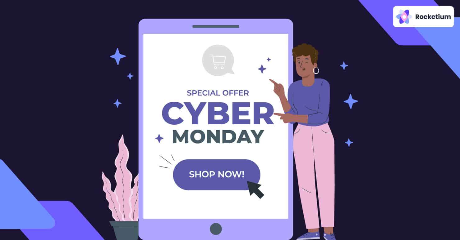
Cyber Monday 2020 lived up to its reputation as the biggest sales shopping day in the US. At over $10.8 billion, US eCommerce brands did far more business than Black Friday, whose total tally stood at $9 billion.
Compared to 2019, Cyber Monday sales were 15.1% higher, making it the biggest online shopping day in the US ever.
So though shoppers were cautious about shopping in-store, online sales more than made up for it.
This isn’t surprising given that US brands save their best offers for last – a kind of showstopper, if you will.
Over the years, US brands have pushed the envelope when it comes to Cyber Monday marketing campaigns.
Most brands start rolling out their holiday-themed offers as early as October-end.
However, in their enthusiasm to ‘start early, start strong’, brands may be missing out on doing the one thing that matters most – building a connection with their audiences.
Starting early does help in terms of trying out different combinations of offers and discounts.
However, most eCommerce brands focus only on the benefits – curbside pickup, free shipping, or free gifts based on order value, VIP upgrades, etc.
Little attention is paid to adapting the creative to suit different cohorts and making the offer stand out.
When Thanksgiving Week finally rolls by, most banner ads are only about discount percentage rather than engagement.
With banner blindness turning into a bigger challenge than ever, this inevitably affects CTR and campaign ROI. According to eMarketer, less than 14% of consumers reported even noticing online ads in 2019.
The solution: focus on design and personalization as much as the offer. In other words, leverage design to boost growth! It is the cornerstone of the Cyber Monday marketing strategies followed by leading brands.
There is plenty of scope for optimization when it comes to designing Cyber Monday banner creative.
After all, to drive sales, you need designs and messages that stick. Top brands like Sephora, Best Buy, Sam’s Club, Petco, or Quip know this well and have been capitalizing on the design factor in their Cyber Monday strategies.
No wonder they enjoy the kind of top-of-mind recall that is the envy of other brands.
There is no harm in taking inspiration from their best Cyber Monday campaigns and replicating it within your own. Here are a few that caught our attention:
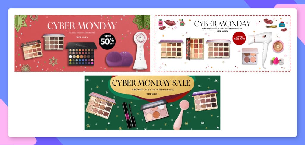
The marketing team at Sephora has managed to churn out captivating Cyber Monday marketing campaigns year after year.
Across web, app, and mobile, certain stand-out elements give us a peek into the brand’s festive season design language.
So let’s see how it contrasts with their everyday banner creative:
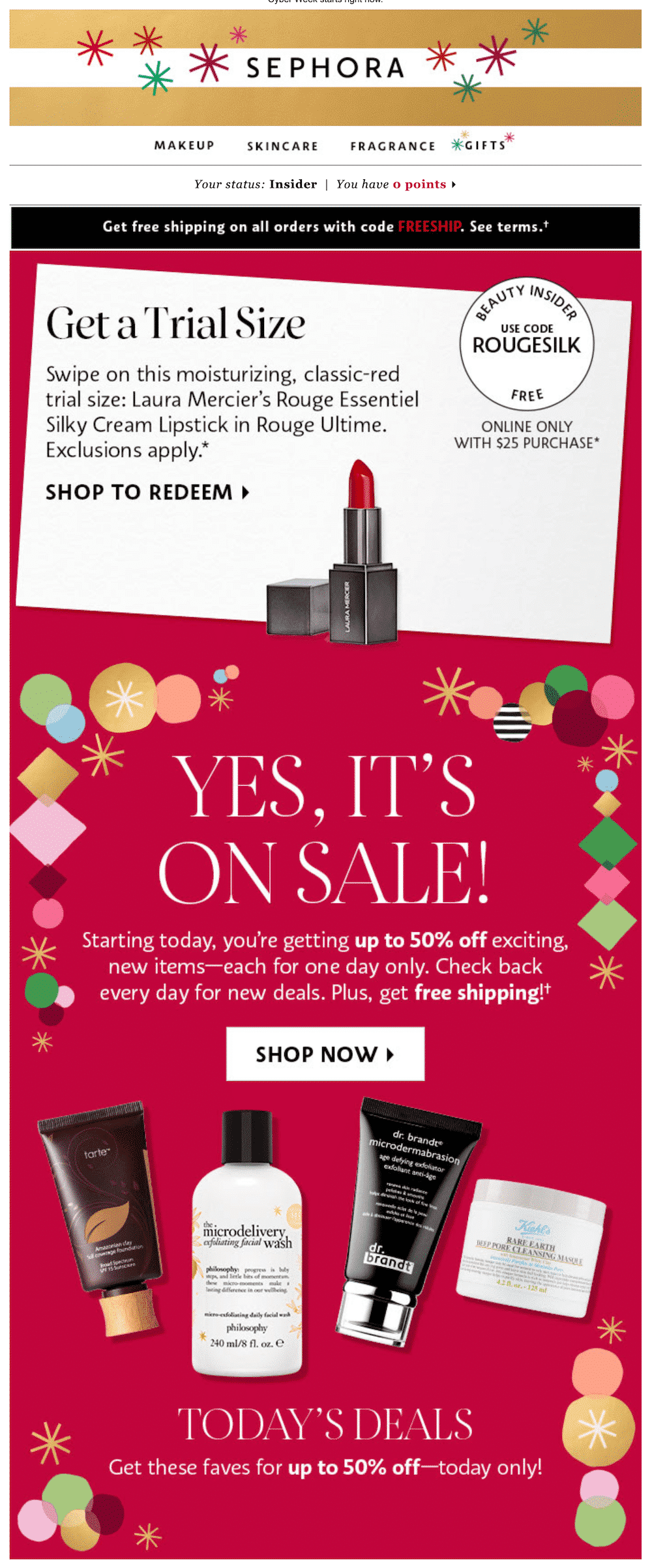
Festive banner ads from the brand use a combination of real and vector images to highlight the best deals while pushing special offers through e-gift cards.
The different product images are offset by plenty of white/negative space, which makes them look attractive.
In addition, vector shapes and patterns are liberally used to draw attention to the ‘today’s deals’ section.
Sephora’s festive ads feature vector patterns in the background which are usually not present in their regular campaigns.
This improves the ad’s visual efficiency, driving engagement and conversion.

A crisp ‘Shop Now’ CTA with a small arrow is a standard feature across festive and regular campaigns. This is in line with the latest minimalist UX trends.
The reason: Basic buttons improve ease of navigation in conjunction with the now-popular F-type text layout.
The brand has standardized on its own typeface, Sephora, across sizes and designs. It consists of three distinct variants – Sephora Sans, Sephora Serif, and Sephora Script, each of which reflects its brand values and creates instant recall.
Serif is typically used the most because of its high contrast and elegance, perfect for a fashion brand.
Sephora uses primary colors to create rich backgrounds, adding to the advertised products’ visual appeal.
In addition, these colors go well with the overall festive theme. That said, the brand is known to experiment with various light-toned themes with vector patterns at different times throughout the year.
It is imperative for beauty brands like Sephora and others to hyper-personalize their messaging during campaigns like Cyber Monday.
After all, they cater to customers from a wide variety of ethnic backgrounds. These customers are also likely looking for new products almost every day.
To maximize sales, brands need to rotate their ads constantly, adding new creative with every new offer.
This is perhaps the only way for beauty brands to overcome the noise and keep customers engaged throughout the shopping season.
Best Buy has put up a strong fight against Amazon with its Bigger Deals campaigns, modeled after the latter’s Prime Days.
The brand has been focussing on targeted mobile banner ad campaigns to direct traffic to its storefront.
This strategy has yielded good results for the brand over the last few years.
In terms of the creative strategy, the company uses time-tested but straightforward design principles to drive engagement.
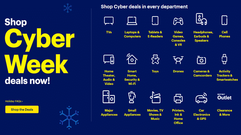
Best Buy evidently likes to keep it simple when it comes to image choice. Take a look at the festive banner above, for instance.
It shows an array of vector icons to highlight multiple product categories, ever so subtly.
The copy is minimal but looks distinct in yellow, driving home the point that Best Buy is a one–shop stop for virtually any consumer tech freak.
However, as the second example shows, Best Buy does use real images quite effectively to create that personal connection with its audiences.
The use of Navy Blue contrasts well with the yellow and white copy, helping the various product categories stand out. The use of these two colors may appear too conservative for a festive ad.
However, it does help users associate it with the company’s latest logo. Notice how the brand’s festive ads are rendered in richer shades than regular campaigns.
The CTA follows convention in terms of being short and action-oriented. There is plenty of negative space between the headline and CTA, which is ideal from the engagement and conversion perspective.
Best Buy uses the tried and tested Sans Serif font to convey a friendly, minimalistic, and modern persona to its audiences.
As you may have noticed, it refrains from using special effects for the sake of readability and consistency across channels.
versus
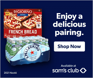
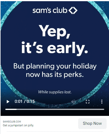
Come holiday season, team Sam’s Club doubles down on mobile re-engagement.
This strategy has helped it push retention and revenues, especially during the festive season.
The company’s banner ads weave a story element to engage viewers and maximize critical micro-moments.
Here are a few design factors worth making a note of:
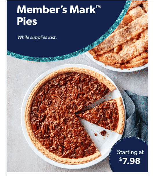
Nothing can capture the essence of savoring festive delicacies like real images.
This interactive banner ad from Sam’s Club uses the image of a scrumptious pecan pie to drive FOMO and create engagement.
For regular ads, the brand favors vector images to push combo offers.
In the first image, the two-toned background complements the vivid imagery of a half-finished pie in the foreground.
The text area to the top-left is an ideal location for the headline. The reason: the top left corner has been proven in eye-tracking studies to get the most attention.
The text area to the bottom right corner complements the larger one perfectly, enhancing the ad’s aesthetic value.
The brand rightly emphasizes ample negative space for maximum readability.
The brand is trying to push the benefits of buying early and avoiding the last-minute scramble.
The copy suggests that shoppers can save big while having a more enjoyable holiday season.
Pecan pie lovers will surely find this message hard to resist!
The use of Avenir Next Pro Bold- a variant of the ubiquitous Sans Serif- allows for a clear reading experience.
Set against a Navy Blue background, the text looks attractive and inspires action.
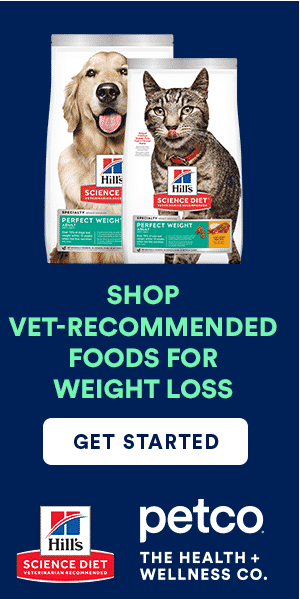
Petco is a household name in the US when it comes to pet supplies. It has a solid reputation for quality.
In terms of creative strategy, the brand is conservative and consistent across campaigns. Here are a few of its features:
In advertising, it is an open secret that images of animals are extremely effective at selling products.
Petco uses real images to create an emotional connection and switches it up with leaderboard ads to push festive discounts.
However, there is a clear continuity between the two in terms of aesthetics.
Festive campaigns follow a textbook approach in terms of color scheme and placement. There is little to distract consumers from the headline and CTA, given the sharp contrast. A simple yet effective combination!
The CTA is direct and tells consumers exactly what the brand expects them to do. There are no shadowed or embossed elements in line with the latest trends.
Instead, the button is scaled appropriately to suit the size of the banner. For year-round campaigns, the company uses a similar template with a clear headline and CTA.
Shoika Bold adds a touch of elegance to the overall banner, complementing the image elements and background color quite well. It makes for a clean reading experience.
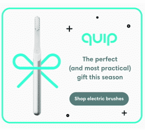
Personal care brand, Quip projects a fun, engaging brand persona aimed at a predominantly young audience.
Its digital strategy thus relies on distinctive, minimalist banner ads with concise messaging. Here’s what is interesting about Quip’s design language:
The first image is surprisingly from one of Quip’s most recent festive campaigns.
As you’ll notice, it stands out for its striking blue-on-white design with a vector image of a brush taking center stage.
The festive theme is brought out by the criss-cross bow element as also the math symbols representing stars.
The white background creates a visual vacuum that forces the viewer to look at the brand logo and the product image.
The design is simple yet gets the point across with effortless ease.
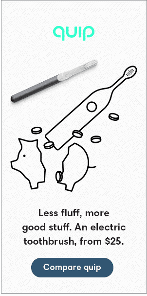
White backgrounds are a standard feature across campaigns, with digital illustrations used liberally for effect.
True to its simple, friendly persona, the headline and CTA do not leave much to the imagination.
For example, in the second image, the CTA button tries to win over skeptical consumers by asking them ‘to compare’ the product with possible alternatives.
This is likely to increase the CTR at the very least and positively impact conversion as well.
The company uses Harmonia Bold for its headlines and body copy, limiting the text to no more than three lines as seen in both examples.
Another noteworthy feature is the use of sentence case throughout the copy, unlike other brands that tend to use both.
This conveys a more casual, laid-back style that is likely to resonate with potential customers.
Most brands understand the importance of being ‘different’ regarding high-stakes campaigns like Cyber Monday.
To this end, marketing teams spend a lot of time and effort on A/B testing offers to maximize CTR and conversion.
However, in terms of design, almost everyone follows more or less the same rules in terms of image quality, design and readability.
Unfortunately, the result is often uninspiring and stale which isn’t ideal for big-ticket shopping events like Cyber Monday.
It is no surprise that they fail to live up to expectations, impacting ROI. Banner blindness is a natural outcome.
Here are a few of the top reasons for this:
Given the volume and frequency demands, designers often have little time to concentrate on their core jobs – design.
Instead, they spend a lot of their time creating multiple ad variations.
Given that Black Friday and Cyber Monday are just two days apart, they are under pressure to deliver fresh creatives.
After all, it is not just a matter of changing images and text but also meeting brand guidelines.
Needless to say, this affects creative experimentation and innovation.
Research shows that localizing banner creatives is vital to driving relevance for specific user groups.
For example, background images, colors, featured models, etc., all need to have a local flavor.
Even the most minor of changes may require a new design.
Most brands try to compensate for the lack of fresh designs by increasing the frequency.
However, this only triggers ad fatigue and poor brand recall.
Multiple reviews, poor follow-ups, and delays in approvals can result in precious time lost.
In the run-up to Cyber Monday, these factors slow down the entire campaign.
With design teams working remotely post-pandemic, the lack of steady communication is one of the biggest challenges brands face in turning out relevant, on-brand campaigns on time.
Maintaining consistency in terms of logo, colors, fonts, and image quality is critical for building brand recognition and loyalty across channels.
However, teams are forced to cut corners when dealing with high volumes and short deadlines.
At such times, ensuring compliance with brand guidelines is often difficult for brand managers too.
For example, if you have multiple design teams referring to different versions of brand guidelines, you may never know until it’s too late.
For your offers to make an impact, you need to personalize your ads to different cohorts at different stages of the buyer journey.
This is critical not just for acquisition but also for retargeting campaigns. Unfortunately, there is often a lack of bandwidth to personalize on a tight deadline, which invariably affects your ad campaigns’ overall performance.
Consumer preferences are changing rapidly, keeping brands on their toes. Besides, different platforms have their own ground rules in terms of size, resolution, and text.
For example, leaderboard banners are often the first to load on a landing page, building context for larger ad units that may appear later.
Without the proper size adapts, brands lose out on vital micro-moments to make a connection with consumers.
Top unicorns like Urban Company and MakeMyTrip have been leveraging the power of design to drive growth.
At a recent panel discussion organized by ET BrandEquity in association with Rocketium, design leaders from these companies emphasized the key role of creative automation in driving relevant, timely, and cost-effective campaigns.
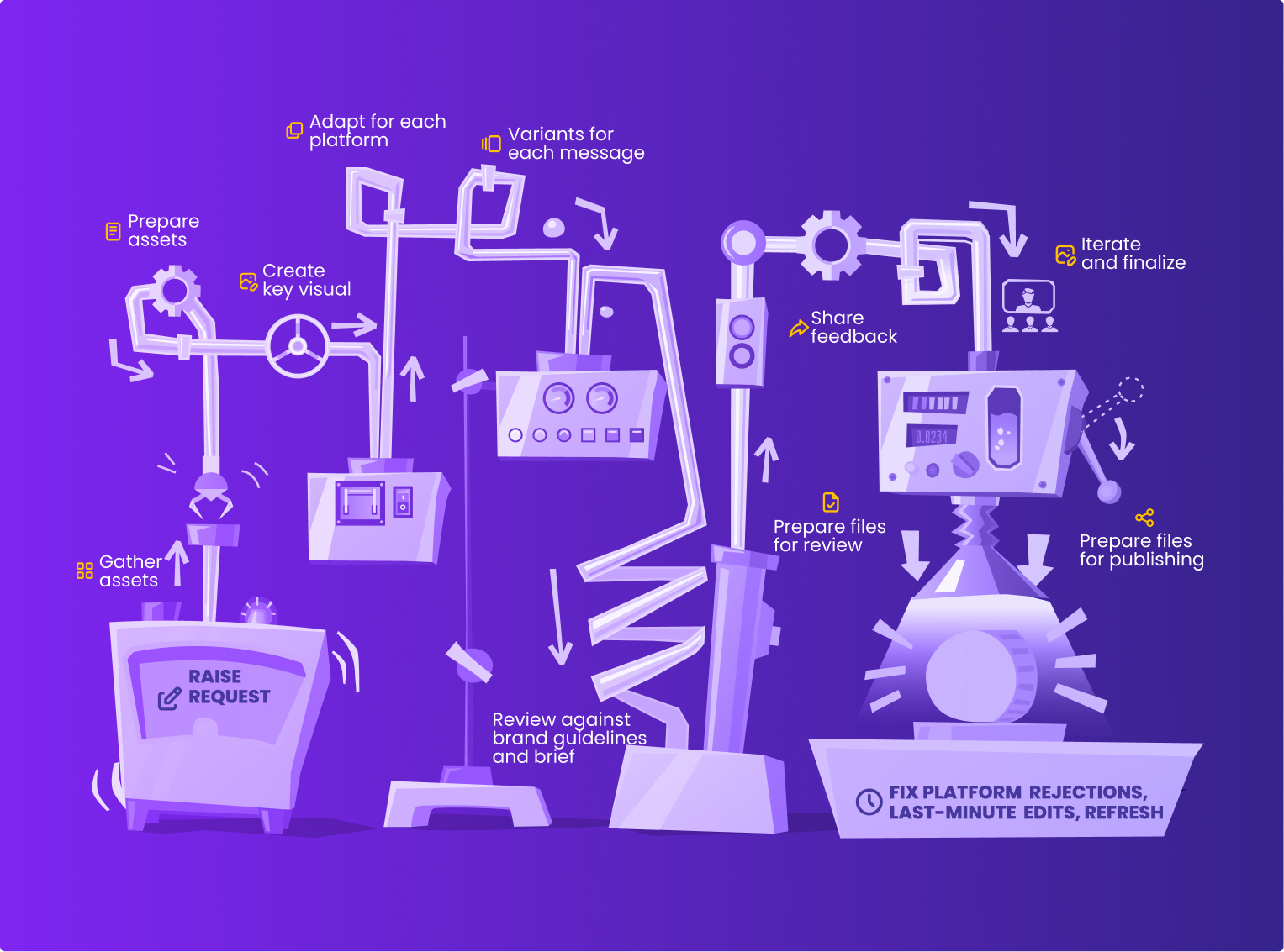
Here’s how creative automation makes a difference:
Innovative design is vital for creating differentiation in a crowded marketplace.
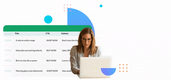
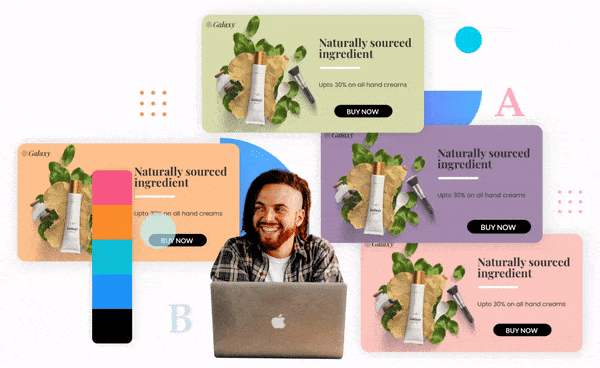
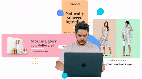
Creative automation reduces team workload by allowing you to create innovative base templates for your brand’s primary objectives and create variants through a feed-based scale.
Now, create custom variations for multiple product categories, offers, and target cohorts within seconds instead of days.
Design and copy must work hand in hand to drive conversion. This requires intensive A/B testing and adaptation.
However, changing images or text rapidly based on the results need not be time-consuming.
With Creative Automation, you can change key elements without altering anything else.
And you can do this faster than ever before, delivering fresh and engaging creatives to match every new offer.
The result: better engagement and ROI.
Most marketing and design teams work in silos by default and need an enabling environment for communication and collaboration.
In the remote context, this assumes even more importance.
The latest creative automation tools allow teams to create and store assets in a single location while communicating in real-time with multiple stakeholders.
This builds clarity and trust, allowing innovation and growth.
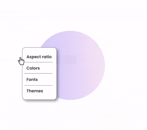
Why do things manually when you can set rules and standardize fonts, colors, resolution, and themes via templates?
Creative automation tools make it easy for teams to stick to brand guidelines by using pre-approved design elements, without constant supervision from the higher-ups.
Running on-brand omnichannel campaigns is effortless with creative automation.
All you need to do is pre-select aspect ratio and size parameters, and the tool takes care of the rest.
This can allow your team to focus on creating content instead of optimizing it for different platforms.
Last-minute changes can be made in bulk with ease.
To capitalize on changing customer preferences, it is critical to create and adapt creative campaigns rapidly.
Creative automation helps you stay ahead of the competition and drive user engagement throughout the different stages of a campaign.
Thanks to workflow automation and one-click publish features, you can create engaging, on-brand campaigns seamlessly.
Rocketium is a leading creative automation platform that empowers brands to build, scale and optimize creative production.
Our comprehensive features and plug-and-play functionality allows marketing and creative teams to work as one unit to achieve common objectives.