Make In-App Campaigns easy and successful
Go live with in-app campaigns faster than ever. Target precisely, schedule seamlessly, and test all you want. Power it all with rich analytics to rinse and repeat.
Learn more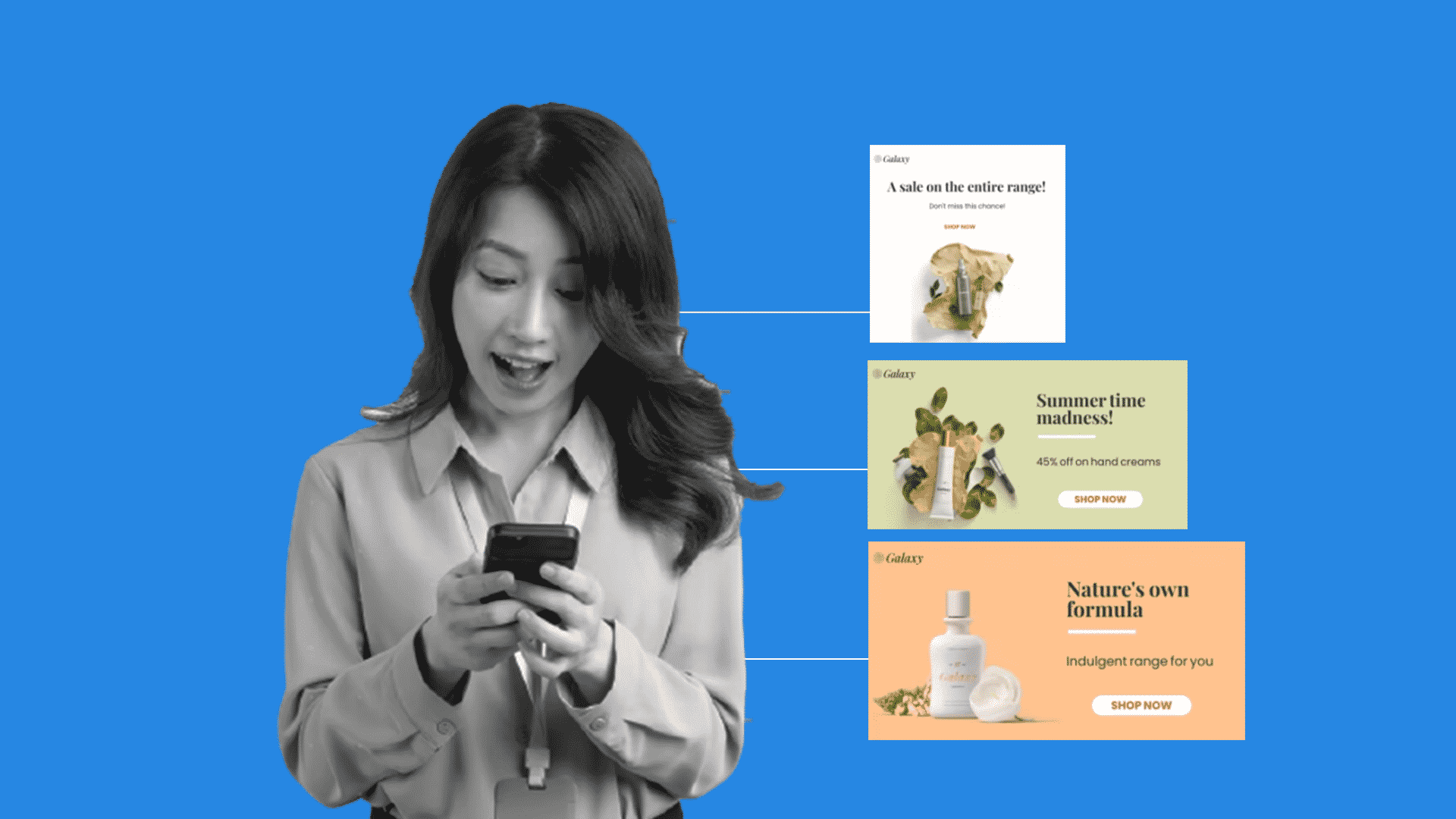
Go live with in-app campaigns faster than ever. Target precisely, schedule seamlessly, and test all you want. Power it all with rich analytics to rinse and repeat.
Learn more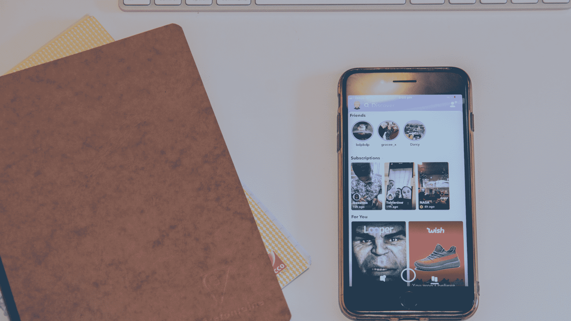
Interested in using in-app messaging for your marketing campaign? When done right, it’s a smart way to improve customer engagement and garner more customer satisfaction. What’s more, it also improves customer retention.
In-app messaging also helps users make the most out of the product that they are purchasing. It drives sales that are connected to relevant upgrades and features.
In-app messaging refers to the messages that users get while using an app or product. These messages can come in various forms. The most popular would be visual in-app messages, but there are others. Examples are slip-outs, notifications, modals, and popups.
In general, In-app messaging aims to attract user attention to give information and generate a call to action.
It is different from push notifications that are external notifications that appear on devices. Users can turn off push notifications while in-app messages are displayed while using the app. It can relay information on recent products, new updates, features, guides, and surveys.
App users can receive messages with no other permissions needed. It uses relevant information related to previous purchases to help spread awareness of new upgrades and products. When done right, in-app messaging can lead to better user retention and, of course, more conversion.

The key to good in-app messaging is giving users relevant and valuable information. You’ll have to guide them using your app and product. This means providing a great user experience throughout the consumer’s transactional journey.
More familiarity makes customers want to use an app or product consistently. Likewise, gathering feedback is essential to find ways to improve your app and products. The timing, personalization, relevance, and conciseness of in-app messaging have a huge impact.
Not all users will want to read your messages, but those that do would really appreciate the information. Here are the steps that you can follow to create the best in-app messages:
In sending in-app messages, you have to identify and segment users correctly. This means zeroing in on your target audience and knowing what they want and don’t want.
Pro tip: It pays a great deal to know the types of customers you have. With this, you can send relevant information that they will find valuable.
Users don’t like visual in-app messages like popups when they’re trying to finish a task. Often, receiving in-app messages at an inappropriate time can ruin their impression of your brand.
Thus, proper timing of in-app messaging is vital. The best time to send messages is when your users have more time to pay attention to the ad. For example, high-school students may be busy with school work in the afternoon. Meanwhile, adult employees may be lounging in their office during that time, looking at their phones. This makes them a better target for that time frame.
Pro tip: Send in-app messages upon opening the app or before closing the app.
Personalized in-app messaging involves proper user segmentation. Users must get personalized information that will specifically be of use to them. One way of personalizing your message is by addressing users individually by name.
Pro tip: Send good morning or good evening notes to users based on the time zone and time of day. Personalized messages can generate a significant impact on making users feel special.
Provide the customers with information that applies to their problems in daily life. Everything should be available at first glance. The message can then call them to action, therefore increasing engagement. When users realize that the information they get is valuable, user engagement naturally grows.
Your call to action should be clear to users. Likewise, you can provide follow-ups in the message. Do take note that users have the option to disregard your message. Still, you have the option of creating follow-ups just in case they were busy at a particular time.
Pro tip: Use intense and emotional words that will trigger their response at first glance.

In-app messages are created for various purposes. With this in mind, there are many types of in-app messages that you can use. Different brands apply the best practices and examples of in-app messaging.
Here are some in-app messaging standards and best practices to drive user engagement.
Onboarding Messages are used to introduce products and services for users who have logged in to an app for the first time. These messages are also applicable to any other particular area in the app that users enter for the first time.
The first-time usage of apps and services can be confusing and overwhelming. The purpose of sending onboarding messages is to guide first-time users. Messages can be in the form of product tours or welcome popups.
Through onboarding messages, you get to engage with your users when they begin using your app or service.
Also, onboarding messages reduce customer frustration and highlight the product features. These appealing messages explain how to get started. You can also incorporate a particular video for your users to watch before they dive in. Add onboarding messages to your welcome email to ensure that new users get to have the best experience.
Examples of apps using onboarding messages are LinkedIn, SnapGuide, Trello, Hubspot, and Slack.
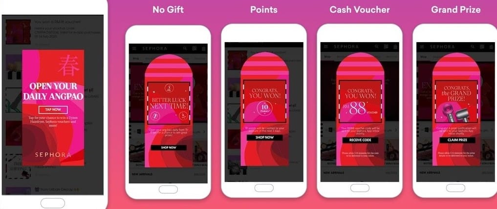
Discount Messages are used to boost conversions. You can opt to offer discounts, coupons, and freebies to your users to convince them to be long-term customers.
Customize your messages and position them at a prominent page location. This helps get the user invested in the page much faster since they are already familiar with your brand. You can use banners to command the attention of the user as they stand out visually. Finally, add compelling call-to-action taglines to seal the deal.
Using popups is another popular option. Popups are visual in-app messages that show up at set times, places and are typically found at the center of the page. For these, choose high-quality images and copies to motivate them to use discount codes.
Also, remember to present popups in an organized manner and not all at the same time. Apps like Sephora and Orelia use discount messages constantly in their in-app messaging.
Feature Announcements inform users of new products, options, updates, and special features in an app or website. Sadly, not all customers use every single feature and service on their apps. Because of that, adopting a product and component can be challenging.
Still, you can try highlighting the best features to encourage users to try them out and support them. You can then use popups to inform users about new updates, products, and options.
Maximize the use of hotspots and tooltips in prominent page areas to get more user attention. This helps them gain access to more information when they click through these options nestled inside images. Google Analytics and Ghost use feature announcements on their in-app messaging.
Warnings and Notifications are used to notify users of essential app changes. Updates on the server, new policies in place, and probable errors are few examples. Some even change business hours, so subscribers may need to be aware of that. To be clear, warnings and notifications differ from one another because of their urgency.
Common warning messages are sudden maintenance, server updates, and errors. It’s geared towards the technical aspect of the app or product. For these kinds of messages, you can use bold colors like red, orange, and yellow.
On the other hand, notification messages inform users about non-technical changes. Things like business hours, policies, and product versions will be valuable to them. Play around with colors like green, blue, white, and grey. Hubspot specifically uses warnings and notifications on their in-app messaging.
Transactional Messages work best after specific actions are performed on your app. A good example is after a registration event or sale. You can include success messages and thank you statements after users sign up or register for your product or service.
You can also send these messages when users give feedback or complete a survey. Here, you can gain more feedback and ratings. Plus, you get to present your product recommendations.
Besides increasing the number of probable sales, you also boost conversions and make valuable customers feel appreciated. Mailchimp and Wistia use transactional messages on their in-app messaging.
Making users aware of new features can be difficult. Of course, you want to highlight a product’s new features to improve product awareness, but it is easier said than done. Not all users pay attention to marketing emails listing new features.
Tweak in-app messaging to appear more personal and relatable. You can also set it to be displayed at your user’s convenient time. That’s better than filling up spam folders of potential users. Favorite apps like Google Docs and Salesforce use new feature awareness on their in-app messaging.
Apps can offer freemium and premium options to various users. Upselling attracts users to experiment with the product that they wouldn’t have done without the free option. They get to use a freemium account with limitations that premium accounts don’t have. Once they’re invested in the trial account, you’ll have to make catchy upselling messages to get users to switch to premium subscriptions.
Remember that freemium accounts should not be too limited; there shouldn’t be too many restrictions. If the users feel restricted, they will choose to uninstall the app and search for other options.
Persuasive messaging and communicating at the appropriate time play a vital role in upselling. Display in-app messages when the user wants to use premium features that are only accessible if they upgrade. Spotify and Grammarly generate tons of conversions with upselling on their in-app messaging.
In-app messaging enables feedback collection from users. It allows the conduct of various NPS surveys within its system. You can gather valuable feedback when customers reach significant milestones while on the app. This can be after completing a form or sending an email campaign.
You can gather feedback as a form of celebration after a milestone. For this, ask users to spare time to share what they think about a product. You’ll get the most out of NPS surveys by ensuring that the users understand your product. Apps like Grammarly and Evernote gather feedback through their in-app messaging.
Reporting plays a vital role in the value proposition. Some complicated features can be overwhelming for new users. They will not fully enjoy a product’s value if they are unfamiliar and comfortable with the how-tos.
Users that get help for their problems drastically improve customer satisfaction and customer experience. Users become more familiar, and typically, familiarity leads to an increase in the frequency of usage. Google Drive and Wells Fargo make use of product adoption on their in-app messaging.
You must maximize selling within the app to drive growth. To do this, make targeted in-app promotions that will keep customers invested in the product experience. Choosing the right keywords and pain points plays a significant role in making the recipient users more attracted to the product.
You can use CTA buttons that show how easy it is to upgrade with only a click of a button. You can also leave an option for users who have questions about sales. The most common apps that use promotional messages on their in-app messaging are SurveyMonkey and Trello.
Good user engagement keeps users from switching to other competitors. They have to feel that their needs are met, their presence is appreciated, and that the company cares. That means communication must be personal, targeted, and unique to each user.
Above discussed in-app messaging techniques are a surefire way to boost user engagement and keep it there for long. Businesses using in-app messages across consumer lifecycle have better conversions and user engagement. In-app messaging like surveys, notifications, or onboarding guides will keep you and your users happy.