Scale creation with Creative Automation
Automate the creative production process with templatized creation, feed-based scale, and multi-point integration.
Learn more
Automate the creative production process with templatized creation, feed-based scale, and multi-point integration.
Learn more
What if we told you, you can generate more revenue with the existing amount of traffic?
Conversion optimization typically translates to better conversions from your current traffic. Better conversions mean more revenue, and more revenue leads to more growth and overall business prosperity.
Now that’s every business’ ultimate goal. And, that’s the reason marketers obsess over conversion rate optimization.
However, the issue with any obsession is that people try to discover the simplest or quickest route to their goal. Not many people are aware that conversion optimization is a step-by-step process that demands patience and persistent efforts.
We teamed up with Growthfolks, India’s largest community of growth enthusiasts, to host a three-part series called “Growthshops: Unlock Growth Experiments.” This blog will cover the steps of conversion optimization from the third session by a growth marketer with six years of experience in the consumer-tech industry – Raghav Shukla, Growth & Product, Urban Company (Ex-Uber, OYO).
Contextual targeting requires you to understand who your users are.
Not all users are looking for the same thing.
Understand at which stage of the customer lifecycle they’re at and target them based on marketing goals set for that stage.
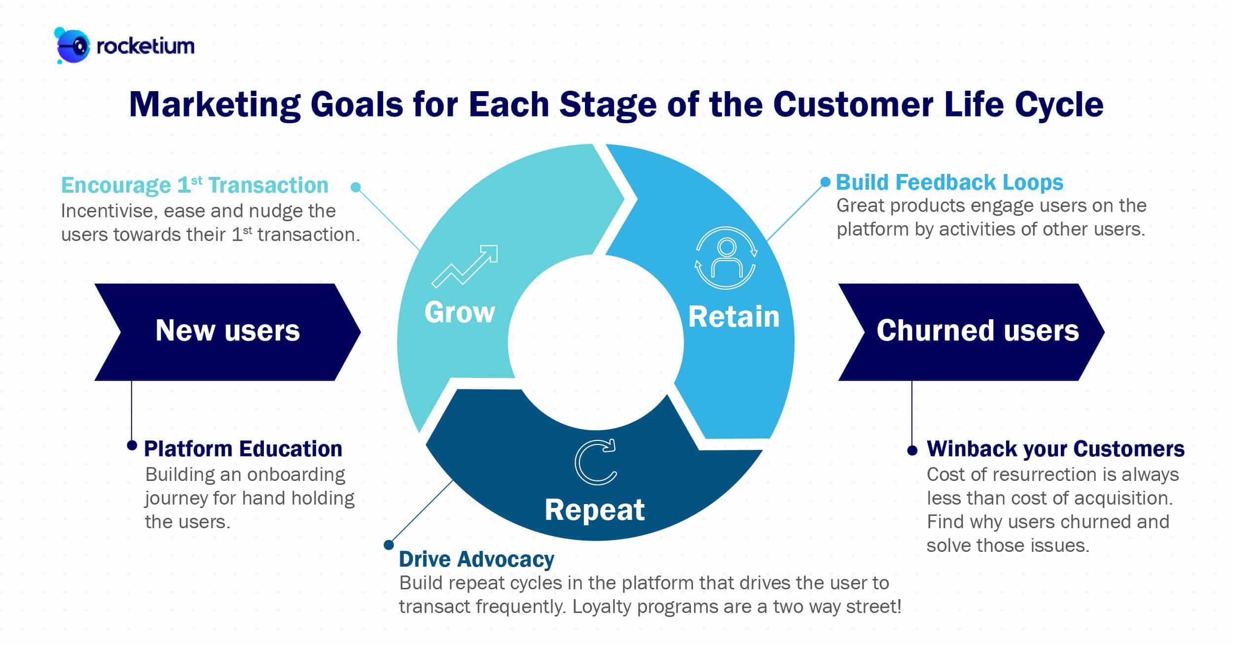
This is an example of the typical lifecycle that a customer would have.
For new users, build an onboarding journey that clearly conveys your core value proposition. Give them an overview of your platform without diving deep into granular details.
For example, Amazon never shows the subscription offers they have to new users. That’s because it would pose too many questions to a person who has not fully gotten to know the platform.
The goal is to familiarize them with the platform and clear any doubts or questions they might have upfront, instead of unloading all your features and offers at the get-go.
Keep some information up your sleeve and serve it to them in bits across intervals. This way, your audience will stay engaged and respond better.
“Spend time building good, educational journeys that can be both on product and in your communications.”
Once the user has onboarded to your platform, the next step is to get him/her to make their first transaction. Incentivize, ease and nudge the users into their first transaction.
Incentivizing does not essentially have to mean offering a discount. Instead, you can incentivize by making changes to the way you present the product to match the consumer’s buying intent and purchasing power.
“By incentivizing, I do not mean bring the price down. Rather, bring the product to the level at which a person can afford it.”
“With Uber, in India, we started with Uber X only, which was the most premium category in San Francisco. We realized that’s not where the customer is. So we had to build UberGo – we realized, in India, that’s not where the customer is either, so we built UberMoto and Uber Auto. All these products exist because people are coming on the platform and it is important that their expectations are in sync with the product.”
Make the transaction process easy. Understand what’s holding them back from making a transaction. Is it a lack of choice in payment methods? Or, a complicated checkout process? Figure out the cause for concern and double down on solutions.
Building feedback loops might not be relevant to all organizations and requires a lot of product interventions. But if you can, it opens the door to better engagement and retention.
The first step in building a feedback loop is identifying your product’s basic feedback loops. What are your users’ most common, repetitive behaviors?
Almost all social media platforms have the following feedback loop: A user posts something, people see it, click a button to like it, and the likes are presented back to the user.
But, identifying your product’s feedback loops can be harder to spot. Yelp built a great feedback loop around their review system wherein customers dine in, leave reviews, and their reviews are in turn reviewed by other people (people can rate the review as “Useful”, “Funny”, “Cool”). This loop is intended to boost engagement and generate content valuable to Yelp’s business.
Once a user has become a repeat customer, the next step is to get him/her to promote your business with their friends, family, colleagues, etc. Transform your most loyal customers to brand advocates.
There are many ways to drive advocacy and engage your most loyal customers, but most marketers gravitate towards running a loyalty program or a referral program.
“Like loyalty – loyalty programs are a two-way street. Best of the loyalty programs deliver both for the customer and the business.”
If you are thinking of building a loyalty program, sign users up and not give them the kind of incentives or discounts they were looking for, can be disastrous.
It needs to be incentivized, but you also have to make sure that you make money out of it.
This balancing act is what makes running a loyalty program challenging to pull off. But, as with all complex challenges, the rewards are there to be reaped.
Goibibo’s Refer and Earn program syncs your contact book so that you get an amount whenever a contact makes a booking on Goibibo.
You’ll also find out who hasn’t registered on Goibibo, allowing you to invite them and earn money.
This is an excellent referral program and also performs the function of a great feedback loop.
Churned users – this is where 60% to 80% of your customers always lie.
“The cost of resurrection is always less than the cost of acquisition. While as an anecdote, this might sound simple and vague – essentially, it means you’ve already invested in acquiring the churned users. And if you acquire more, there’s a 60% chance that they’ll get churned too. Instead, you could take all these churned customers and tell them how you’ve changed or how your platform is better now and invest in that.”
The first step to sustainable growth is to fix or improve what you have. There’s no point burning your marketing budget on acquisition if your new users face the same issues as your churned users.
Find out the reason why your customers churned. The cause of churn could be the product, platform, or communications. Find out what it is, and make changes where necessary.
We recommend that you interact with these four types of customers to determine the hiccups in your workflow.
“ At OYO, in 2017-18, we did a lot of impact programs, where we talked about how OYO has changed. We only targeted customers who left a bad review or rating because we knew their pain point. We told them we are sorry – we’ve changed, and here’s some incentive to get going on the platform.”
Communication is the cornerstone of any business. Understand your users and communicate precisely that which will get them to engage on your platform.
As we mentioned, not all users are equal or the same. Therefore, your messaging will vary depending on the type of user you are targeting.
In the first step, you understand who your users are and what the goals are for each of them. Next, you move onto what to communicate with them to get the conversion.
This is an example of a classic new user email. They are just conveying what the platform is about and what they will do to make it easy for the users to try their product.
They have broken what they’ll do into three simple steps that are meant to guide the users to the final goal: conversion.
No overload of information, no over-the-top exaggeration, just simple communication.
That should be your mantra for new user messaging.
Remind them to complete a task that they might have abandoned and handhold them towards their goal. These are your most active users, and a little nudge will keep the habit loop intact.
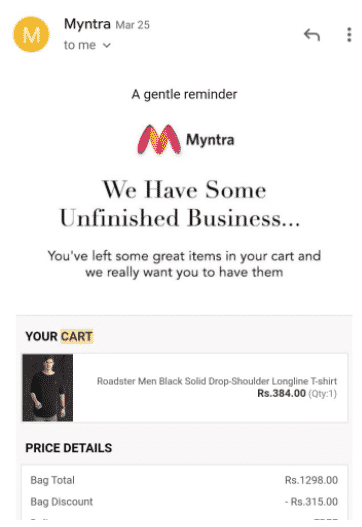
For an eCommerce company, this could be as simple as sending an abandoned cart email or notification.
Understand what could be the reason they churned. Then, work on their feedback and convey the changes you have made.

In the case of Grammarly, they would’ve found that users churned because they didn’t want to use a secondary app but use it across different sites. So they made the changes and sent the message to only churned users.
“User is always telling you what they want. They drop enough cues across the platform through what they are clicking. We just need to make that wish happen faster.”
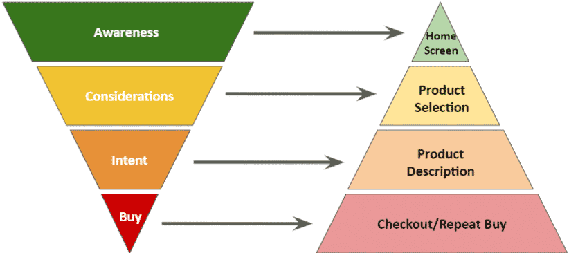
Where do you send users when they are clicking on/to your platform?
Pro Tip: “Invest some time with your tech team to build deep links. Deep links make sure the exact page you want the user to see opens even if they do not have the app installed. For example, suppose a user does not have your app installed – they click on your link, which takes them to the app store – they install your app, and when it opens, they go directly to the page you wanted them to go to.”
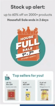
This is an email from Grofers that talks about a sale that they have. Depending on where the user clicks (top or bottom creative), it takes them to two different landing pages.
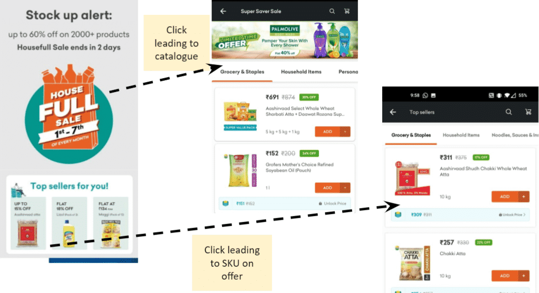
Clicking the top creative takes the user to a product catalog page with all the products on sale.
Clicking the bottom creative takes the user to a page with exactly those products shown on the creative. They’ve done this because if the user has clicked on it, they’re interested in those products or similar products. Hence there’s no need to show all the products that are on sale. Instead, directly take them to a page with products from the creative.
Eliminating the number of actions it takes for users to reach their goal is a step towards conversion optimization.
When a user is on your platform, help them make faster decisions, or better, make it for them.
You do that by creating contextual landing pages.
5 pillars to create a contextual landing page:
If you have these five pillars of information about your user, you can build a highly contextualized landing page.
Below is an example of a contextual homepage of an eCommerce app. But you can build the same for your business following this framework, provided you have enough information about your users.
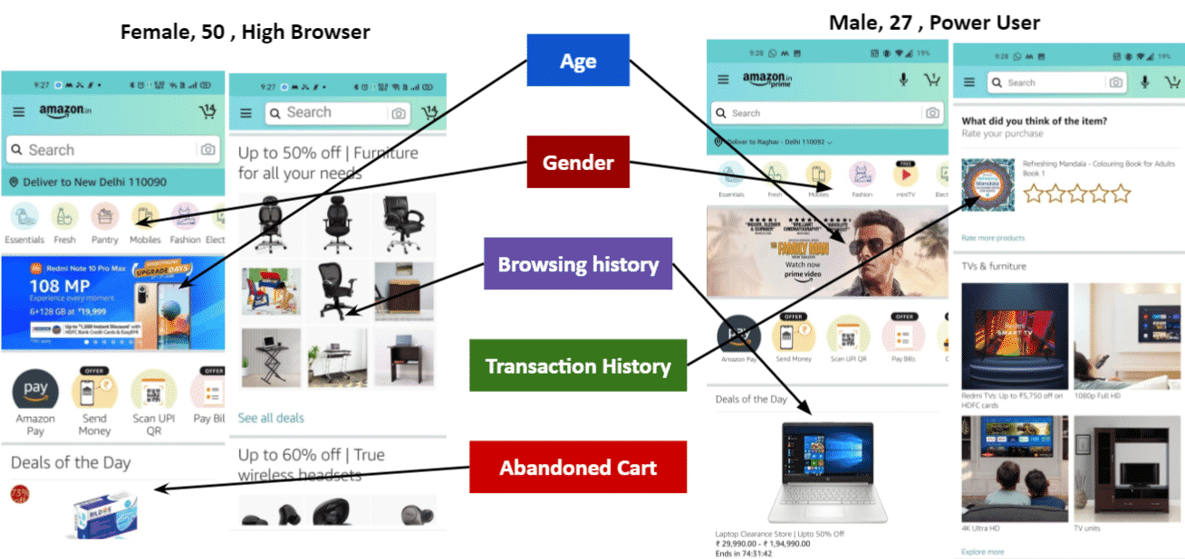
This might look a bit overwhelming, don’t worry; we’ll be going through it in detail so that you get a good grasp on how to create a contextual landing page.
These are screenshots from Raghav and Raghav’s mom’s Amazon app at precisely the same time.
For Raghav, in the hero banner, Amazon does not show any product. Instead, they promote a show that’s on Amazon Prime that Raghav has not seen.
For Raghav’s mom, Amazon promotes a smartphone with a 108 MP camera. Of course, anyone who knows smartphones knows that 108 MP doesn’t really mean anything.
But Amazon understands that they’re communicating with a person who would not know this information generally when talking about a person who is 50 years old.
Raghav’s mom has a “Pantry” icon in the top drawer, whereas Raghav doesn’t. This variation can simply be chalked up to the difference in gender.
Raghav and his mom were browsing on Amazon for two weeks to set up a workstation for the latter. Raghav was given the responsibility to buy the laptop, and his mom took the responsibility to buy furniture.
From the image, you can see that Raghav started to get deals on laptops displayed on the homepage, whereas his mom got offers on chairs and tables.
Amazon knows Raghav is a power user. He makes purchases almost every week.
He recently bought a book that is not sold a lot. So they used the space on the homepage to garner a review from him.
They know he is on the platform frequently, so there’s a high chance he’ll leave a review.
The purpose here is to build a feedback loop that Amazon can share with other users in the future.
From the image, you can see that Raghav’s mom has 14 items in the cart – most of which were masks. Hence Amazon shows deals on masks on the homepage.
Besides having transparent pricing, customers are looking for fast checkout. At its core, conversion optimization is all about getting the users to make a purchase as quickly and smoothly as possible. To do that, there are two things that you should focus on:
Not having enough payment options is one of the biggest reasons for poor conversion rates. Make sure you cover all payment options that your users might opt for.
“There are about ten different payment methods available on Zomato right now. This is great because once the person has reached the checkout screen, Zomato is essentially saying, ‘no matter how you want to transact, I’m going to facilitate that.’ ”
Understand how you can build an easy payment system for your business.
“In the case of stockbroking apps, you can add money through UPI. You do not have to go to your bank a/c and add a pay.”
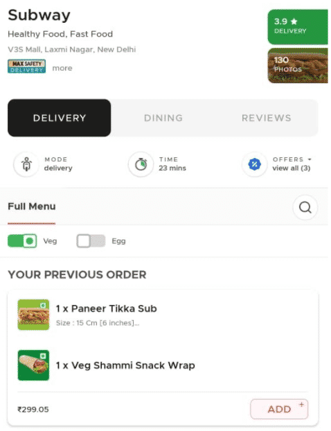
Customize your platform based on users’ browsing and transaction history and provide suggestions to help decision-making.
“You open Uber in the morning; the first address they show will be to your workplace. Similarly, on the weekend, they would show you the nearest pub or restaurant that you often visit.”
“FoodTech companies remove cognitive load in decision making by promoting repeat orders.”
From a marketing perspective, conversion is the end goal. How well you lay the path to this goal determines the increase in your conversion rate. That is when you’re looking to improve conversions; these five steps of conversion optimization should help you create a quick and easy path for your users to purchase from you.